Hey you! Yes, you. Are you looking to promote your campaign to get higher Conversions? Then a website floating bar is the best way to do so.
Why? It increases conversion rates by up to 845% (if done right) and is highly effective in driving sales to your brand.
But, what is a website floating bar? Continue reading in order to find out the answer to this question!
What is a Floating Bar?
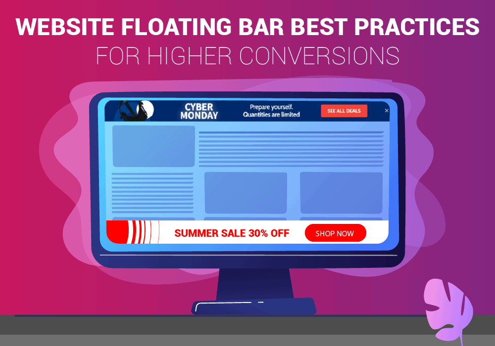
Website floating bars are like “sticky notes” that are attached to the top, bottom or to the side of your website as long as your visitor stays on the website. It locks its place and is visible even when the user scrolls through the page.
Floating bars are kind of like popup bars, but not exactly what you are thinking. They don’t “popup” after a few scrolls or times. They are part of the website.
Floating bars are best for building your email list, getting higher conversions for your product, promoting offers, increasing brand value, social media presence and so much more.
Floating popups need to have a strong and relevant CTA to get the best out of them.
Here are the top 5 practices that you should do using website floating popups to increase your conversion rates.
Keep Website Floating Bars Small and Simple
It might be tempting to make large website floating bars to get the viewer’s attention. It actually does but it annoys them too and annoying them is definitely a bad thing.
The user might simply leave the website and will never come back again and why not? He intended to view the article or website, not your popup.
Keep it small but not too small. It must be visible and not annoying. Use “good colors” and don’t use flashy ones to attract viewers. Website floating bars are to increase conversion rates, not decorate your website.
Use a Countdown Timer

Are you struggling to find the right first customer? Do you get people who only view your offer and do not take action?
Then this practice is incredibly useful when promoting or providing limited-time value products or services. This creates a sense of urgency for the users and makes them click anything that would be of use to them. Some brands were very successful just by incorporating a countdown popup timer in their website floating bar.
Some brands use countdown timers to make people purchase something within the given time period to avail themselves of a discount. It’s a very interesting tactic.
Announcing Discounts
Announcing Discounts onto your floating bars and to users is a good way to entice them to buy something. If you have a good online presence, especially on social media, you can ask your audience to check the offer out. If people are interested, they will definitely buy these.
Just by incorporating, let’s say “30% discount on your first purchase” or something like that, eyeballs will already be on the floating bar. If the floating bar was enticing and had high-value elements in it, congratulations, you got your sale.
Use of Lead Magnets
What are lead magnets?
Let’s understand this with an example. You want a user’s email address to build an email list. But, what if the user doesn’t want to share them. But, what if you give them a free Ebook or tutorial or a document, anything that is something the user is searching for. The chances of him signing up just shot up.
Lead magnets are marketing tools used to generate leads by offering something exciting in exchange for a potential client’s contact information. These are basically “exchange offers”.
So now, you can directly message or email them or build an email list and do email marketing. This method is incredibly useful if you are a coach or have expertise in something and want to share them… for a price of course.
Using Different CTAs (Call-to-Action)

Using a compelling CTA on your website floating popup is great. However, I don’t think you want to just add CTAs like “sign up” or “buy this” and you shouldn’t. You should add CTAs connecting your social media profiles, an event or a consultancy call with regards to your expertise.
It’s great to see a sign-up Call-to-Action for your potential customers. But, what if the person has already subscribed and a floating bar with the same CTA pops up? It gets boring, right?
A simple solution to this would be to show different CTA to your subscribers and potential customers. You need to differentiate them. Show potential customers the “sign-up” CTA and show your subscribers new website floating bars like “event joining, social media handles” and so much more.
This phase is somewhat an experiment. Only by experimenting can you know which one works best.
Conclusion
Floating bars are a great way to increase conversion rates if you have a relevant and compelling CTA. Floating popups are said to increase conversion by 845% in some cases.
There aren’t any “100% working methods” to boost conversion rates using floating websites. It’s all about experimenting with the floating bars. By following the above-mentioned method you just got an idea and have a higher chance to boost sales. It will not guarantee you sales.
What floating bar strategy are you working on right now? Is it your primary lead generation tool?

