
User experience (UX) is everything when it comes to eCommerce. It’s what drives an individual to shop from a particular website and, crucially, want to return there.
But with no face-to-face interaction or physical sales staff to guide the customer journey, how exactly do you ensure a positive eCommerce experience? Here, we help you understand what a good eCommerce UX looks like, and how to do it right.
What is an eCommerce user experience?
The truth is that eCommerce UX is a lot like any other UX. Wherever the user is, whether in a brick-and-mortar store or on a website, the company providing the experience wants that user to feel relaxed, happy, and in control of their actions.
Looking online, if information needs to be imparted to get that user where they need to be to complete the purchase, then a quality website will provide that information in a clear, and readily available fashion.
Ultimately, there should be no stress or strain involved in product selection or at any other customer journey stage. There should also be a feel-good factor throughout the process, propelling the user through the purchase stage, and beyond.
You want to see the customer return to make repeat purchases. It’s well known that repeat business is the real engine of business growth. For instance, 80% of profits come from 20% of customers. Repeat business is vital, not least because it’s cheaper to get a sale from a loyal customer than to find a new one.
UX is vital to turning a first-timer into a loyal customer.
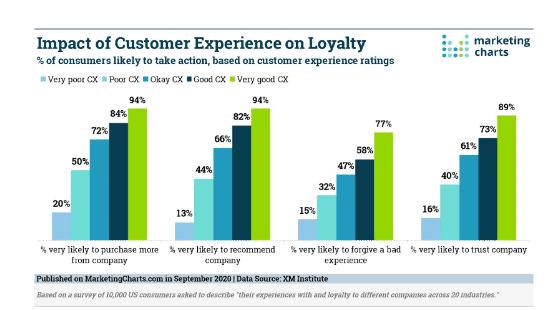
Image sourced from Marketing Charts
This is one reason why getting UX right is so important. Another is that great UX gets talked about so that other customers are enticed into coming on board too. The bad news is that lousy UX gets talked about, too, with predictable results.
Let’s look at how great UX is shaped.
Speed is king
Your competition is right there at your shoulder. Customers can click away from you, and onto a competitor’s website with the greatest of ease. All it takes for this to happen is for you to give your customer a bad UX. And the quickest way of doing this is by being slow.
Such is the tech strides that have been made that people are no longer as forgiving of slow loading speeds as they once were. It’s been observed that even after only six seconds of loading time, one in two visitors will abandon a website.
So, if your site is a little tardy in getting itself loaded up, you must streamline it. Cut down on the images and the videos where you can, or at least optimize them for display. Look at your Javascript for bloated code, and see if you’ve got too much Flash content. Make sure you’re using cache techniques. Check your hosting provider’s infrastructure.
If all this is gibberish to you, talk to your website designers, and tell them you want a quicker-loading site. They’ll get it.
Responsivity rules
This is a way of recognizing the device used to access the site, and adapting automatically to optimized parameters.
You need your site to be at its best no matter how people choose to access it. For a long time, websites were designed on laptops or desktops, and were only really suited to this method of access.
However, more and more people are accessing the internet on the move, which means that more, and more ecommerce is conducted with a mobile device. There’s been steady growth recently, with the expected blip back in 2020.
So, it’s clear that mobile devices are on the up when it comes to ecommerce. The sites that win biggest will be the ones that recognize this fact while not scrapping the traditional computer route.
Clarity is crucial
Once you have your website loaded, and ready for action, you should present the user with a clear path. Whatever they want to do, whether it’s browsing products, going straight for the purchase, or even just finding out where the brick-and-mortar store near them, should be instantly clear what they should be doing.
It’s this attention to clarity that will enhance the UX, and reduce the bounce rate.
Consider landing page design from the perspective of the new user. Assume they know nothing about the company – they’ve merely arrived because they looked up ‘cargo pants sale,’ for instance. Make sure they get taken to the cargo pants page if that is what they looked for. And that the route from there to the buying stage is clear.
It’s great to have other information on the site, too but think about construction so that extraneous facts don’t get in the way of a smooth purchasing experience.
For instance, it’s good to know that your company’s shipping is carbon neutral, and that the entire company is a zero-tolerance space for abuse. But have that information available via a link rather than flagged up in customers’ faces. Virtue signaling can be very tiresome.
Consider whether selling is properly prioritized (without being pushy). A good site, just like a good company, should have the best sales enablement tools.
Personalization is a priority
Throughout commerce, personalization is gaining importance. What was unexpected and sometimes even unwelcome has become a standard of customer experience that most customers love, and almost all businesses seek to provide.
What do we mean by personalization in this context? One key approach that scores with customers is showing that you know their preferences, and acting on this knowledge. For instance, if you’ve bought woolly socks from the site before, there might be a section on the landing page highlighting other big-knit items that might appeal to your chunky side.
This can help with that clarity question. Rather than having to go looking for more of my favorite woolly socks, I have them right there, a mere click away.
Personalization is a godsend for a company plagued by abandoned carts. There are all kinds of reasons why a cart might be left. Perhaps the site’s too unclear or takes too long. Or it could be a reason that’s nothing to do with the site itself. Life can be pretty busy, and sometimes there’s just no time to see that sneaker purchase through to completion.
This is when personalization swings to the rescue. Using the contact details that the customer will have submitted in the first place, a company can seek to get that customer back in the checkout groove. It might be an email, or it could be an SMS, or it might be a welcome back message that greets the customer the next time they hit the site.
This can be a very effective means of getting the sale done, but it takes the right tone. You want to be helpful, not hectoring. It could be that the customer just went off those pants. That’s OK. Our pants are not all cut from the same cloth. How about a link to our new range instead?
Personalization can make UX feel like the whole operation’s been put in place just for them. And that, essentially, is the secret of good customer service. It’s all about user engagement, and personalization is one of the best user engagement strategies.
Support is supreme
For those times when things go wrong, you need to provide the means to get them right. Sure, you want the experience to be blissfully trouble-free from initial browse to repeat purchase. But reality has a nasty habit of taking that desire, and plopping it on its head. So remedies have to be ready.
The omnichannel world means, of course, that support is available in all manner of guises. It could be a simple FAQ sheet that does the trick. If the customer has a common query, they may be able to clear that situation up in a matter of seconds like this, or they might want to try a chatbot.
For yet more unusual requests, there’s email, voice calls, social media messaging… all manner of routes available. Some people have a set favorite contact method. For others, it depends on the nature of the request.
You have established a range of support instruments so that if a customer needs assistance getting their UX back on track, you’re there for them, whatever their preference.
In this way, what could have been a negative experience can contribute very much to a positive user experience.
Again, clarity’s the order of the day. People in a pickle aren’t going to want to have to struggle to see the way out. Here’s an excellent example.
It’s friendly, super-clear, and includes details for their international offices, with (rarity alert) contact numbers included.
Conclusion
Like most things in life outside of the factories of Lockheed, good customer UX is not rocket science. It’s what we would all like to see everywhere.
With that in mind, it makes a good deal of sense. Look at how other sites improve – can you learn from them? Keep checking back, as nothing stays static, and you must stay in the ever-evolving UX vanguard.
Does your site do all it should do while giving the customer nothing but happy times? If so, congratulations, you’ve got great UX. But do re-test soon.