In this pandemic time, the demand for online business has increased tremendously. Every customer prefers availing of online services, due to which the competition to turn online visitors into leads and then into potential customers is growing day by day. To stand out from the crowd, organizations are putting their best efforts into improving their website development process. This is all because 8 out of 10 customers are interested in paying for a better user experience. For maintaining the user interface of websites, companies refuse to use popups. The reason is that many of them believe that it might ruin the user experience.
Indeed, it’s challenging to please everyone landing on the website. But there are still various ways that you can follow to boost your conversion rate using pop-ups without destroying your user experience.
Now, without any further discussions, let’s take a closer look at the ways to build a strong sense of urgency to convert visitors into potential customers.
Tips for using Pop-ups without hurting User Experience
Let’s get started…
Ignore using entry pop-ups
One of the major reasons pop-ups are killing the user experience is that some organizations are using them when visitors just enter the website. Entry pop-ups interrupt not only the typical browsing but also affect the reading flow. Also, it will make visitors feel confused. That’s why everyone hates entry popup-ups.
If you don’t want your visitors to get annoyed by the pop-ups, then you need to show up at the right moment. Show pop-ups to your audience when they are just about to abandon your site using exit-intent technology. For this, you need to evaluate the average time people spend on your site. By showing the simple pop-up at the right time, you can make people feel less harnessed with the offer provided to you.
Thus, before you bother your audience with the entry pop-ups, let them get familiar with the services and products. To resolve this issue, you can fix the number of seconds people spend on the page, and the percentage of pages scrolled down by the visitor. It will help you to catch the reader’s eye easily and will get more conversions.
Showcase relevant and informative content

Visitors will surely hate your website if you display pop-ups that are irrelevant to the content. If the content you offer in the pop-up solves the issues of your target audience and can help them to get the right approach, then it will not be perceived as annoying; rather, people will love to see more about the content shared in the pop-up.
Many organizations use pop-ups as an extra navigation tool instead of promoting an offer. Yes, you are reading it correctly. You can utilize pop-ups to redirect the traffic to some useful and informative content. So, do not display pop-ups on every page of the website, rather create a strategy, understand the power of content and add the pop-up that only resonates with the respective website page.
Prefer to customize your message
This phrase is totally true, especially when we discuss pop-ups on websites- “If you’re selling to everyone, you’re selling to no one.” Say if you are focusing on everyone while creating a pop-up, then probably, you won’t be able to convert a single lead. Obviously, everyone has their own goals, interests, and concerns, and a single pop-up will not resolve their queries.
So, if you want to improve your user experience through pop-ups, I recommend you personalize your message as per your target audience. Whenever you compose your pop-up campaign, you always need to keep your target audience in mind. Based on the behavior of your audience, you can frame the content and generate visitors’ interest.
Also, it’s not recommended to share the same messages with every individual. Rather you can divide your audience into two different segments, named cold prospective and hot prospective. On the basis of groups, you can customize the message using dynamic text replacement. It will automatically update the text in your pop-up, which will further improve your user experience and conversions.
Don’t miss A/B testing

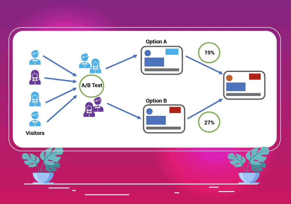
If you don’t want your pop-ups to be harmful, then make the best use of A/B testing. It will help you better understand which pop-up is helpful and which can affect the user experience of your website.
Through this testing, you can better understand which design elements and messages can work more effectively and what content should be removed from the message to make it more optimized, simple, and appealing at the same time.
Once you know which pop-up is acceptable for our audience, then you can easily create similar pop-ups and see better conversions on your website. So, don’t be in a hurry while creating and inserting a pop-up to your website, as it needs both your time and effort.
Don’t display too much information
Sometimes adding too much information to your website can have a negative impact. If you want your prospects to value your content without getting distracted, then you can always give a special reward to your visitors after they sign up for your newsletter. Like you can offer them free ebooks, free gifts, discount coupons on the services, etc.
Also, when it comes to filling up the form, don’t ask for too much information because everyone hesitates to share their personal details, especially at the initial stage. So, whenever you design the pop-up for your website always keep in mind that “Less is more”.
Use Non-intrusive Interstitials
Do you know Google allows non-intrusive interstitials? Yes, you can restrict the content from the audience. There are many forms of pop-ups that cover a large proportion of your screen. Like banner ads, inlines and tabs, slider-ins, etc. If you want to utilize this tactic, then I would recommend 15% or less.
But if you are not sure whether the selective interstitials are intrusive or not, then instead of considering full-screen overlays, consider ad modals and mats. You can go with side-in boxes or top banners. This will allow visitors to read the content without affecting the user experience.
Use pop-up once a month for the same readers
If you want to see good results from the pop-ups without actually affecting the user experience, then I would recommend you ignore using pop-ups more than once a month. This tip will not only give new content to the readers but also helps in making your website design engaging.
Read more about 7 Ways to Improve the Customer Retention Rate on Your Website.
In a Nutshell
Indeed, many people struggle to incorporate pop-ups on their websites. Whereas some are curious about whether they should add a pop-up to their website or not. Adding incorrect and irrelevant pop-ups might ruin the user experience and affect your conversions. But it also can be a blessing for marketers to capture quality leads if displayed timely and appropriately.
Hopefully, the above points will help you in making your pop-up campaign a success. Still, if you have any concerns, or facing hassle in creating one, feel free to share in the comments below.

