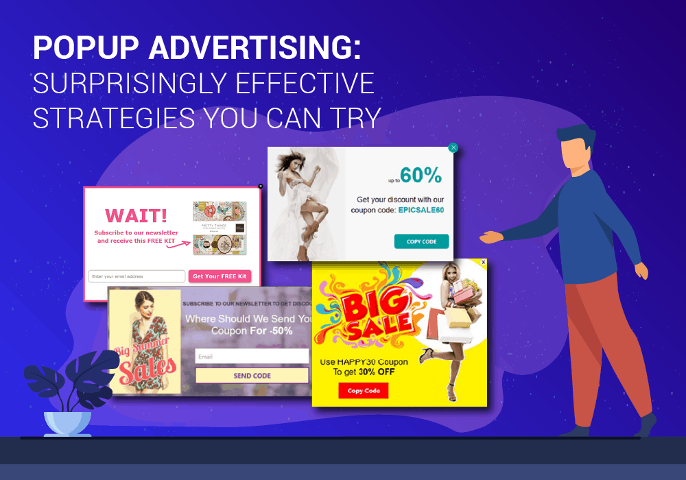
While unfortunate to note, popup advertising often gets a bad rap. For some, it’s invasive, distracting, and simply annoying. However, they don’t have to be! When used right, popups can make your website more engaging and can help enhance the overall experience of your visitors.
No wonder many consider using popups as one of the best web design practices you can look into. Amazingly, the average popup conversion is at 3.09%, with the best at around 9.28%. One study found that changing a sidebar opt-in form to a popup increased the subscription rate by a staggering 1,375%!
Popup Advertising Strategies: Best Practices to Follow
Below are some of the most effective strategies you can try when doing popup advertising:
Hide the Form on Your Landing Page
Hiding the form on your landing page is considered one of the most effective and innovative ways to use popups. What makes this strategy effective? There are two powerful reasons.
- The more form fields a landing has, the lower the conversion rate. On the contrary, if your landing page has zero visible form fields, the conversion rate can increase significantly.
- Click popups (sometimes referred to as click triggers) have been known to convert up to 12 times better than any other type of email popups. This can be attributed to the fact that the visitors trigger the popup’s appearance. In other words, they requested the popup, and there’s no surprise element.
Provide a First-Time Buyer Discount

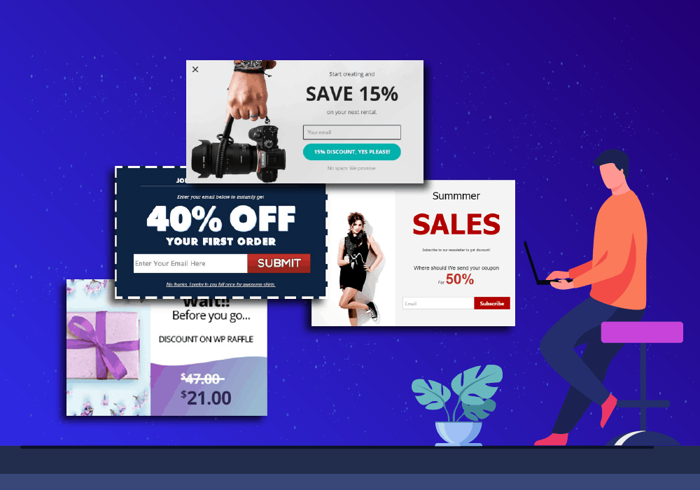
If you are considering buying something from a company and a 10% discount is available, it’s safe to assume you would like to be informed about it. Essentially, what makes this popup advertising strategy ideal is it delivers relevant value when the visitor wants it.
Come to think of it, most people would consider a 10% discount worth their email address. This is especially true if they genuinely like your product or are interested to learn more about what you have to offer.
Offer Exclusive Content, eBook, or Content Upgrade
When offering exclusive content, eBook, or content upgrade, you must offer something your visitors will find beneficial and relevant. Keep in mind that your website visitors are often in the middle of reading a paragraph when your scroll or time popup appears.
Making content exclusive can help increase the subject value visitors place on your content: what is not publicly accessible is likely to contain more valuable information than what’s available publicly. Locking valuable content behind an email gate would be a clever way of using pop-up advertising.
Advertise a Free Demo
Over 92% of website visitors are not ready to buy. However, it does not mean they are not interested in learning more about the products and services or the brand. Prompting a chat that discusses the benefits/cost of your product or service is one of the exit-intent popup use cases that really hit it out of the park.
Popups of this type will best work as exit popups. It is recommended that you give visitors as much time as they want while on your pricing page. Rushing them with a scroll or timed popup will most likely do more harm than good.
Add Urgency to Your Offers
Adding urgency to your deals, sales, or promotions can have a massive impact on your revenue. The best way to add urgency to your offers would be to use scrolling headers or opt-in bars.
Countdown timers embedded within footer bars or scrolling headers are also considered a great idea as they won’t interrupt the visitors’ ability to interact with the website. They will remind visitors about limited offers, so they have the option to engage or miss out.
Send Visitors to a Relevant and Email-Gated Landing Page
Here’s something many people don’t know: popups can be a powerful way for visitors to navigate your site. One of the reasons popups work is they are guaranteed to be seen. So if there is something you would like people to see (for instance, a lead magnet), using a popup would make perfect sense.
If you have an upcoming sale, a limited-time promotion, or a webinar, you can use a popup to promote a single landing page from multiple pages on your site. Nowadays, you can use tools to manage content download offers and newsletter signups so you can convert more visitors and maximize your advertising budget.
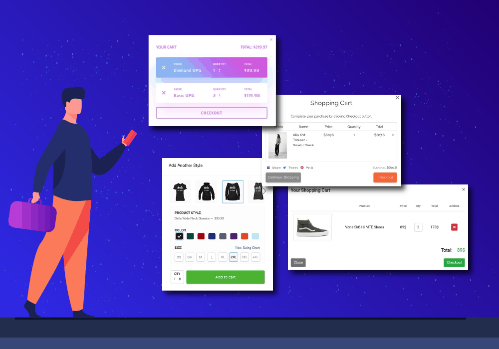
Counter Shopping Cart Abandonment

On average, 69.57% of e-commerce carts are abandoned. With that in mind, the importance of getting prospects to stay on the checkout page cannot be overstated.
One of the best ways to counter cart abandonment is to use a popup that addresses the common reasons for abandonment. Below are some of the principal reasons visitors abandon shopping carts:
- Extra and unanticipated costs
- The site required them to create an account
- The checkout process is too long or too complex
- The cost up-front is not calculated/visible
- The site had errors
- The site crashed
- They are not satisfied with the return policy
- Delivery was too slow
- Their credit card was declined
- The payment methods are limited
Adding an exit-intent popup that gives visitors access to someone they can talk to so their abandonment concerns can be addressed can make a world of difference.
Over to You
Laid out above are just a few of the surprisingly effective ways you can use popups. Test them out, tweak them when needed, and it won’t be long until you find a strategy that will work best for you.

