You have seen popups across the web, and you might even be using them in your own marketing. When used well, popups can be a powerful way to help you grow your email list, reduce website abandonment, and drive conversions.
However, badly used popups detract from the user’s experience. They may disrupt the customer journey, create a bad sentiment, and cost you the sale. Ultimately, this will slow down your business growth. This is why you should avoid annoying your visitors with your popups.
This article outlines different ways to prevent you from alienating the people that come to your site.
Read on as we explore 7 genius user-friendly popup tips to avoid annoying your visitors.
1. Time it Right
Whether you’re using your popups at the start or right at the end, it’s important to get the timing right. You can time your overlay to display at the moment your visitor lands on your site as a way to welcome them, show them what to expect, and encourage them to keep in touch – all without seeming pushy.
You can also use an exit-intent overlay in a nonintrusive way to stop the visitor from leaving. This allows you to reinforce your marketing message and gives you another chance to convert them into customers or subscribers.
2. Get the Frequency Right
Occasional user-friendly popups can be very effective for increasing conversions, but when you show them too often, they can quickly become annoying to your visitors. That’s why you need to get your pop-up timing settings right to avoid annoying your visitors with your website floating bars.
For instance, you can show your popup every (x) number of days. Some marketers like to set the popups so that they reappear each time the browser is closed and reopened. However, a better option may be to set your popup to reappear after a defined number of days, e.g. every 14 days. You can also consider using countdown popups.
3. Hide the Popup on Your Landing Page
If adding more form fields results in reduced conversion rates, it stands to reason that if a landing page doesn’t have any visible form fields, then its conversion rate would be higher. This example from Smart Passive Income shows a landing page where the reader has to click to download a free guide.
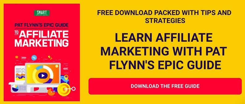
The popup only appears after the user clicks on the button.
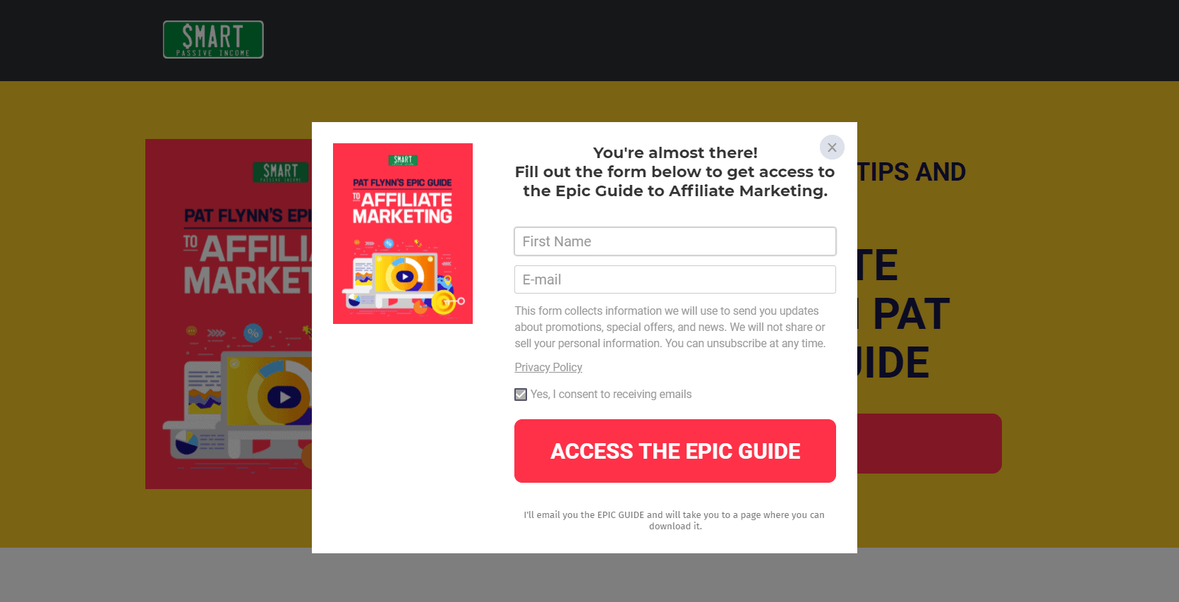
This is one of the most effective ways to use user-friendly popups. When you use the click popup, you will get 12 times better conversions, according to a recent survey.
That’s because the popup appears when triggered by the visitor, which means there is no surprise element. You could say the visitor requested the popup, which in itself raises the likelihood of a conversion.
4. Use Smart Subscriber Recognition
One of the best ways to avoid annoying your visitors is to use Smart Subscriber Recognition. This feature allows you to hide popups on your site from users who have already signed up for your email list.
This feature also works with the “Thank You” page so that if a user has already been to that page, the popup will no longer be shown on the computer that they used when subscribing. This feature is particularly useful for subscribers who use one device. However, the Smart Subscriber Recognition stops the popups from appearing on all the user’s devices.
5. Make it Fun and Easily Consumable
Your user-friendly popup should not be a subtle sales attempt. Rather, it should be a tool that you use to enhance your reader’s experience.
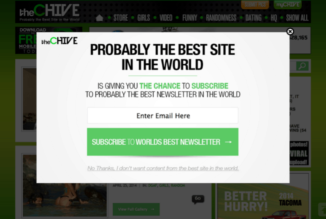
Don’t be afraid to use wit, humor, sarcasm, and fun to make your pop-up more engaging. Just keep in mind that your reader must be able to immediately understand the key takeaway.
Here is a great example of a user-friendly popup that uses humor to capture the attention of its readers.
6. Keep it Authentic for Your Brand
The user-friendly popup you use on your website has a higher chance of resonating with your audience if the overall design is authentic to your brand.
Make sure that you choose a design that aligns with your core brand message as this will help to enhance your visitors’ interaction with whatever content you offer, which could be:
- Giving a first-time buyer discount
- Offering content upgrades, exclusive content, etc.
- Advertising a free demo or free trial
- Reminding users of a limited-time-offer
- Combating shopping cart abandonment
- Generating scarcity to capture the customer’s interest
- …and so on.
No matter what your goals are, by giving the overlay a look and feel that is the same as the website, it makes it a lot less intrusive and more likely to get the message across, as in the example below:
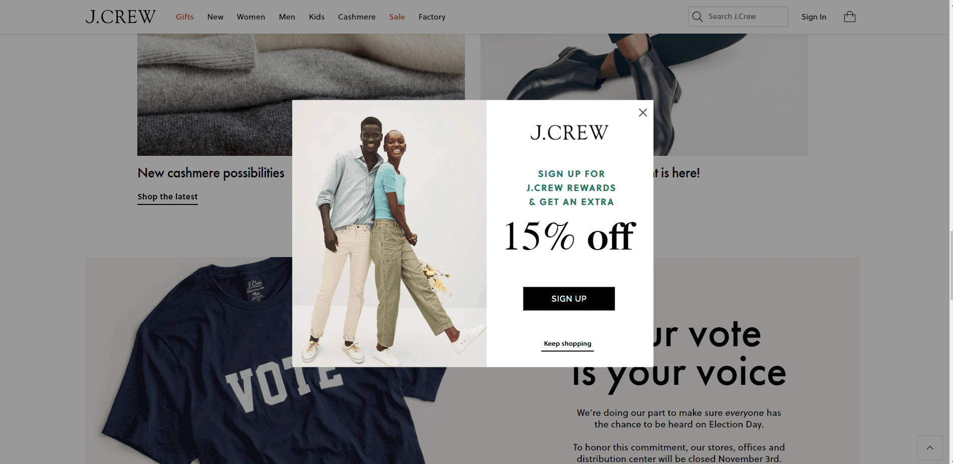
7. Prioritize User Experience
Finally, you must make the experience of your visitors your top priority. From the time they get to your website until they are about to leave, your focus should be on making the experience the best one possible so you can forge a lasting relationship with each potential prospect.
This is a major challenge for all sites, but you can go a long way in enhancing user experience by timing popups so they don’t interrupt the browsing flow of your website visitors. This ties back to the first two tips on getting the timing right to prevent alienating or distracting your visitors.
Also, avoid using vague-looking or flashy pop-ups that seem out of place on your website or stuffy, corporate-sounding copy that will bore readers to death.
Conclusion
In summary, here are the 7 genius user-friendly popup tips to avoid annoying your visitors:
- Time it right
- Get the frequency right
- Hide the popup on your landing page
- Use the Smart Subscriber Recognition feature
- Make the popup fun and easy to consume
- Use a design that is authentic to your brand
- Always prioritize the user experience
These are just some of the many different ways you can design user-friendly popups that work great in your favor. Use a tool like PopupMaker to create mobile-optimized user-friendly popup templates that are easy to customize and launch on your website.
Test each of them, tweak them, and use them in your marketing strategy as a viable way to grow your business.
Which tactics do you use to avoid annoying your visitors? Let us know in the comments section below!

