Best pop-up design ideas do not come from scratch, they come after good research. 🙂
A cleverly and attractively created website popup can significantly swell your website conversion. There are several points to consider for getting the desired results with popups on your website.
Firstly, you must know your audience perfectly well. This is when the research phase is so essential. Investigate the preferences of your users and make sure you offer what they are interested in.
In other words, you should make targeted offers with the best popup campaigns. These are the campaigns that may bring profit and more income to your online store, business, or service. Put an accent on what your users are most engaged with.
Another no less important point is the way you’re going to display those targeted offers. Popups will, of course, bring you the desired attraction, but you should also take care of showing them at the right moment, to the correct audience. This is what we call picking the right popup triggering event.
And, if you have a geo-location option in your best popup tool, you can easily target your audience by their countries and their national preferences.
Let’s check the top 3 best pop-up design examples, that may be helpful for your website conversion.
Explicit Subscription Pop-up Design
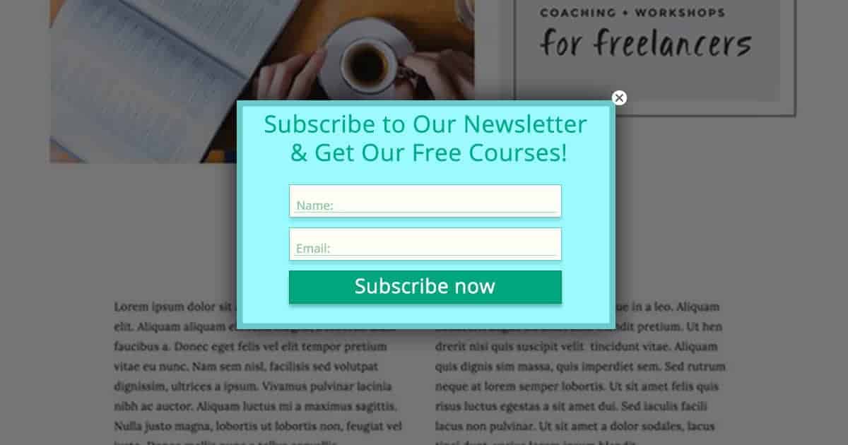
Sometimes users don’t need much to be convinced. The only thing needed is to provide a clear, explicit subscription popup, without any additional pop-up design components or tools. A simple, fair subscription popup, with some motivating text, may bring you more conversions than you may think.
If you have something to offer to your users who you want to become your subscribers, you can do that in the simplest way. You don’t even need to include many additional fields in the form itself. Just include the Email field, can’t go without it, and a simple “Submit” button to send the request.
To make it inviting, just pick a nice-looking background color for your popup, and that’s it
Inviting Offers
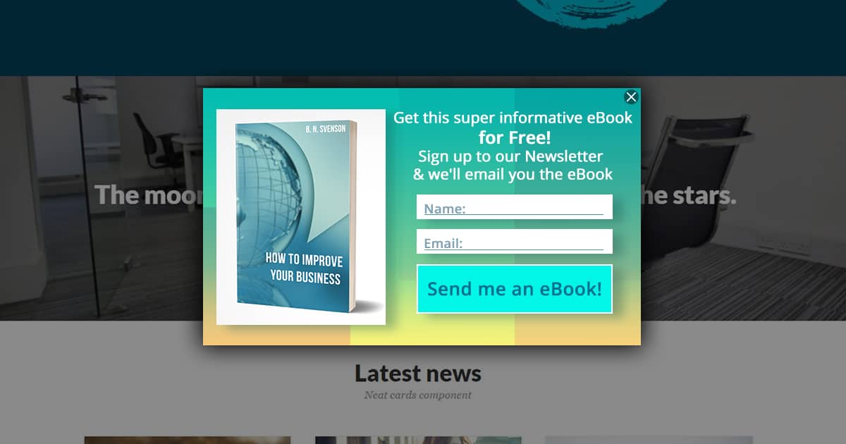
So you have some nicely enchanting offers for your users? Go ahead and present them along with your subscription offers. In other words, bribe your users to turn into your subscribers and get prizes.
Like, if you have eBooks about the stuff connected to what you offer on your site, you can present them for free, offering users to subscribe to your mail list.
The tricky point, in this case, is to preset the offer in the most optimal way, not to push them away. Make them believe that that’s the best deal they will get. Turn your psychological and rhetorical skills on and convince your future subscribers to accept your “brilliant” offer.
This is a deal that will bring twice your profit to you. On one hand, you’ll grow the number of your subscribers, on the other hand, you’ll spread the info about your service to a wider audience, thus promoting yourself.
CTA + Countdown Promotion
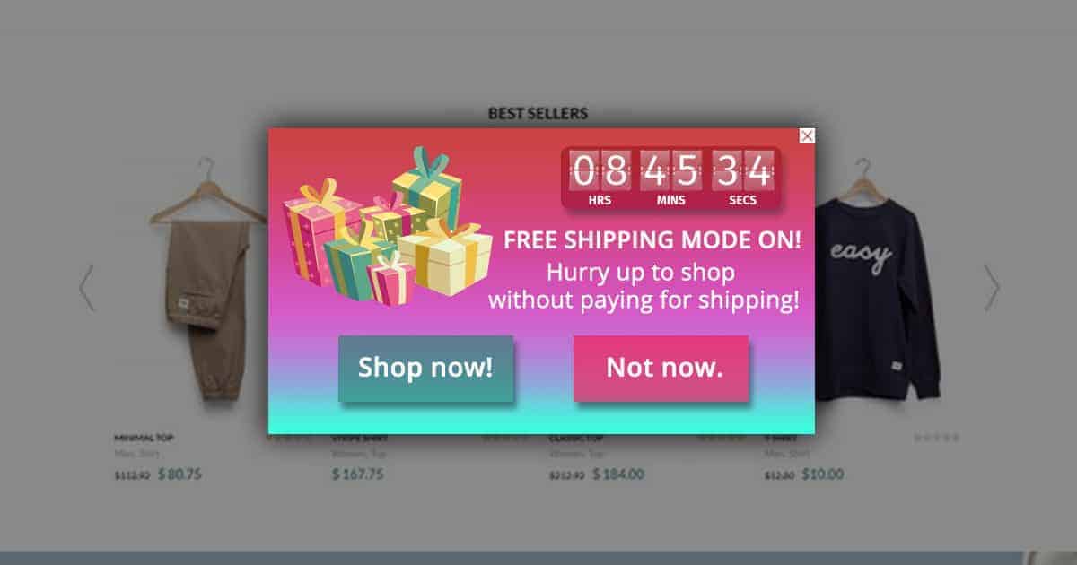
There’s no other more compelling way of pushing users to some actions rather than counting down the offer. It’s a proven fact that the users are very much more likely to complete some actions and finalize purchases, for example, when they are time-limited.
When it comes to popups, countdown forms are the best engine to actualize this task. Just show your offer with a countdown bar in the popup, with the expiration date/time of your offer. And, if you are offering something really enticing, this trick will doubtlessly work.
If you’re running an online store, the best thing apart from sales may be free shipping. This is, for sure, a proven weapon to double your sales and attract more shoppers to your store.
The pop-up design aspect is quite paramount in this case. You shouldn’t save any effort to get the best-looking and charming popup for your offer. Make it impressive, so that it will catch the shoppers’ attention as soon as it appears. Consider some points not to make it repulsive. Acknowledge enticing colors and the font family of your text inside the popup. Include positive images (if any) to make the offer as friendly as possible.
Reverting Exit Intent Offers
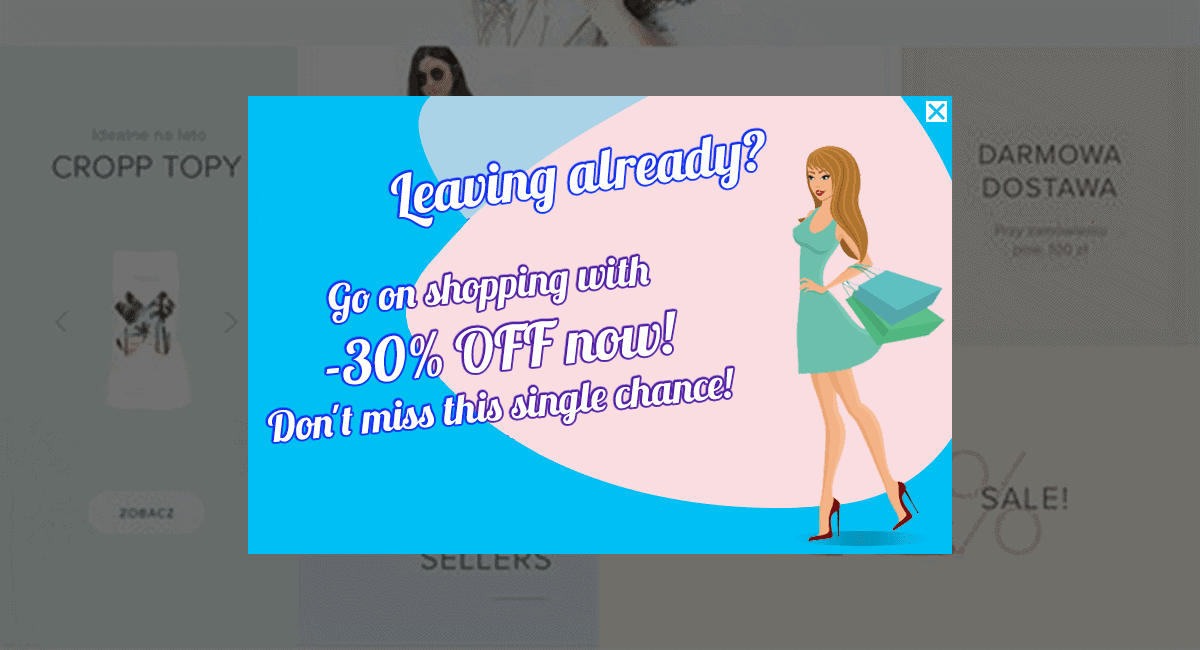
Exit Intent technology has taken its place as one of the most efficient tools to convert more users online. No other technology is more effective and eye-catching rather than exit intent. Just when the user is going to leave the page, the exit-intent popup appears offering something intriguing to bring them back to shopping.
Although this triggering event is the most effective and preferable one, you should put some efforts to have a worthy popup to have the desired effect.
First of all, you may offer some discounts with exit intent to attract the user and convince him/her to come back and complete the shopping.
But above all the points you should put a major accent on the way you present the offer. I mean, you should think about the pop-up design and make sure it will interest your users and they will pay chief attention to it.
Spin-the-wheel Offers
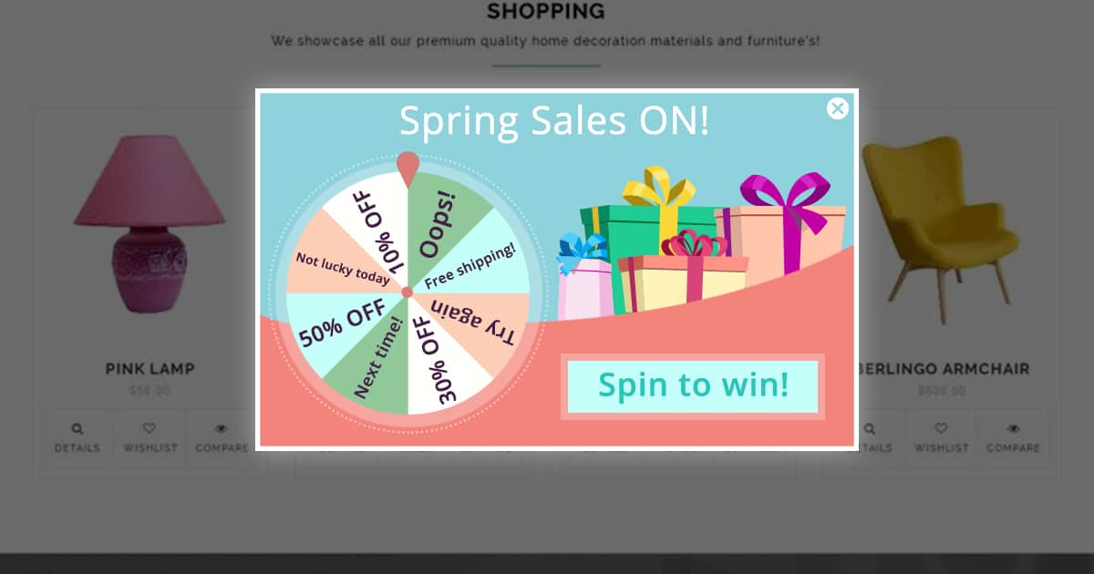
We all know that people are a little bit of gamblers by their nature. Take this fact into consideration and use it to convert your abandoning visitors.
Spinner popup tools are now one of the most effective and popular means of showing special offers inside popups to convert visitors. This is the most eye-catching way to show some offers like discounts, sales, gifts, etc. to collect more subscribers or shoppers. Simply show your offers inside the slices of the spinner and put a button so the users can click to win one of the gifts in the spinner.
The spinner itself is quite attractive and enticing. Even if you include no additional images inside the popup along with the spinner, it will attract and engage your visitors. Just make sure the popup will be shown only once a day to each visitor, so they will return for the spinner game every day, for more shopping.
Conclusion
Taking all the notes and points into consideration, we can surely say that cleverly and strategically created popups can influence website conversion. Best popup examples vary for each website style, they differ according to the theme of your campaign, and depending on the audience you present them for.
No matter what type of popup you construct for your campaign, you need to be well informed of your audience preferences.
Show your offers inside popups and catch your users’ attention and navigate them to what you offer. If the offer is presented correctly, with a beautiful pop-up design, make sure you’ll get your conversions for sure. 😉

