A lightbox popup is a powerful tiny tool that can bring great success to your eCommerce business. Any website has the potential to raise conversion rates with a nice email list. And lightbox popups are the exact tools to provide the highest conversion in the easiest way. Just a correct and clever usage of lightbox popups will bring you so much profit that no other ad wouldn’t do.
Almost all internet marketers are now developing email marketing approaches to reach better results and get higher conversion rates. And the popups are the most mighty means when it comes to email marketing. The best impressive way to attract visitors’ regard and ask them to provide their email.
Let’s check the top 5 lightbox popup samples that will manipulate more email optins!
Fun-game lightbox popups
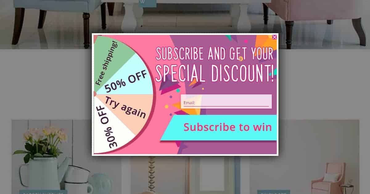
Practice shows that people don’t usually pass by game-like offers on a website. We all are fond of games in any form, especially when there are prizes at the end of the game. If you strive to get more leads and more email options on your list, you ought to think about some kind of game offers to motivate your site visitors to subscribe to your lists.
The spinner lightbox popup element is one of the greatest tricks of our days. This is a kind of a magical tool that’s attracting more users to your approaches and turning them into your subscribers. Users provide their email addresses and the wheel with prized spins. They get a prize, like a discount, and you get a new subscriber all fear!
Engaging autoresponder emails
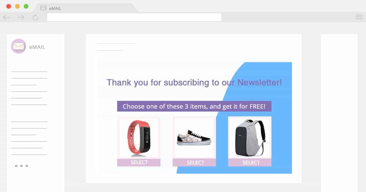
Autoresponders are one of the greatest automated system tools that can hold your visitors engaged and keep the connection with them. After they enter their email address, it’s not the end. An automatically sent email with a nice offer can easily turn them into your subscribers and then turn them into your true customers. To improve your deliverability and avoid being marketed as spam, make sure to verify new email addresses.
The point here is to have proper content in the automatic email, so the users won’t consider it spam, but will engage. Offer discounts, free items, and free courses things that will surely interest your visitors and persuade them to subscribe to your newsletter. Moreover, they are pretty likely to do some shopping in your store, if a nice discount is offered in the autoresponder email.
“Polyglot” popups
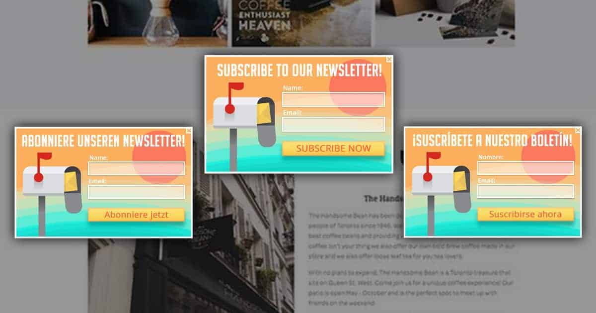
Ever thought about an international kind of popup? Like, display the same popup in different languages for each visitor specifically.
Of course, you may have visitors from all over the world. People who speak different languages. They land on your website and see lightbox popup ads in one and the same language (often in English).
But what if you could display the popup in the very language the visitor supposedly speaks? The language detection will be realized following the browser language of the visitor (this is the most optimal and legal way possible 🙂 ).
This is a perfect way to engage with each visitor, specifically. You can exhibit your lightbox popups to each visitor, according to their language, thus resulting in more conversion on your site.
Lightbox popups depending on the page-visit count
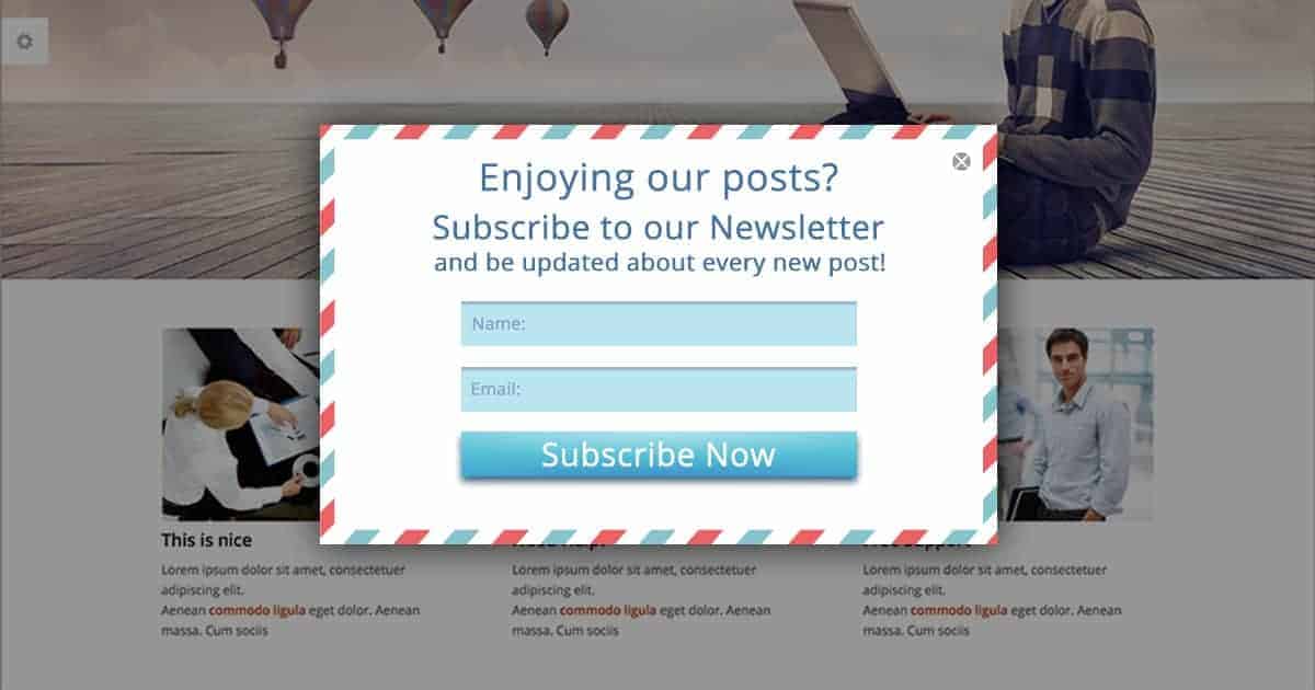
Being not annoying for the visitors is the number one factor for a good and professional website when it comes to the usage of lightbox popups. Picking the right moment to show a popup offer is one of the most important points you should consider.
Make sure the visitor is interested in your service, and ask them to subscribe to your list only after you’re sure they are likely to share their email with you.
One of the proven and effective methods is showing a lightbox popup as the user visits a specified number of pages on your website. If you have a blog, for example, let them read a couple of your posts, then offer them to subscribe to your newsletter for more updates on your posts. This is a proven and safe way of collecting email options.
Just before you go…
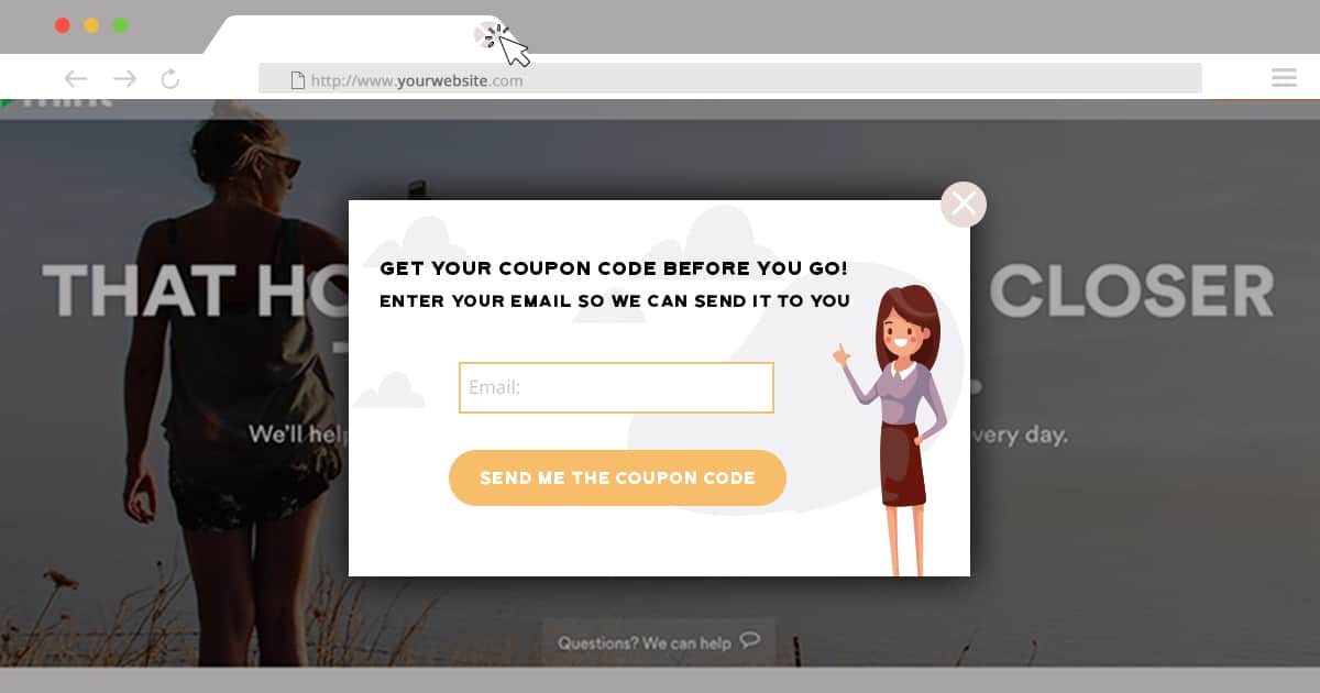
Abandoning visitors are real bad luck for any website owner. This means your content, service or products are not engaging for the visitors. Be ready to lose your business if things go this way.
But you can prevent this and revert your abandoning visitors with a nice lightbox popup, offering some enticing deal for the visitors.
No visitor will refuse a good discount coupon code. Consider this fact, and create an engaging lightbox popup that will ask the visitors to subscribe to your email list and get discounts for your store. Double the effect and display this enticing offer on exit intent, and the conversion is guaranteed.
Conclusion
Excited to gain more email optins with alluring lightbox popups? Start your campaign today, right now, and improve your website conversion rates in a couple of days. Following the methods shown in this post, you’ll see the positive effect just after you start your lightbox popup campaign! 😉

