CTA (call to action) buttons, naturally, are considered to be the ultimate aids that are able to conduct your website higher level of adaptation than you ever viewed. As a good marketer, you’d better know well that visitors who don’t click, won’t convert. No conversion process can pass without a CTA button clicking on your website, be that a checkout or a sign-in/up procedure.
In this post, we’ll discuss Yes and No buttons in popups, as a highly adapting means for your website. CTA buttons evolve with the main aim of taking care of keeping the right balance between accuracy, info, and temptation.
Dozens of means are offered for the usage of Yes and No buttons in popups, we’ll check top 5 of them. 😉
Yes and No Buttons For Engaging Phrases
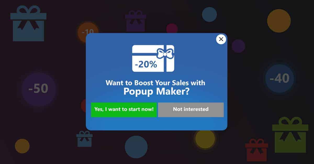
When you are making offers on your website, you should ascertain it’s engaging. Ensure your deal will catch your purchasers’ consideration and will move their concerns.
The demonstration is one of the most essential points you should work on when making offers. Present your offers in the most enticing way. Form it is sure no one can resist it. Target the points you think will entice your invitees the most. If this is a digital product or a service, the head purpose of using your service will be boosting their sales, for sure. So, keep this in mind and make your proposal relying on this circumstance.
In regards to the usage of popups on a site, you can be sure you already got the mind of the users. It’s hard not to notice them. Yes and No buttons make your popups interactive and escalate the bound with your consumers. Deal with this when making any type of offer on your website. This practice will not only reach your offers to your consumers. You’ll escalate the conversion ratings as well, making users click on the buttons and select the answer to your offer.
The next point is the colors of the Yes and No buttons in your popup window. Colors can play a greater role in your promotions than you think. Pick complementary colors for your buttons to make the contrast even more noticeable.
Complimentary colors are the ones opposite to your dominant color on the color wheel. Research has shown that the user tends to pick the button with the “green” color most of all. Considering this fact, you should make the “Yes” button bright green, and pick a complementary color for the “No” button.
But a better trick, in this case, will be making the “No” button in a less noticeable color, like “gray” to catch the attention of the “green” button and realize your offer. 😉
Collecting Feedback
Effective feedback can be very helpful, no matter negative or positive. It’s generally the indicator of the quality of any product/service. Most of the lead services are lead services due to the fact they constantly search for ways to make their best even better. Such services pay greater attention to the constant and stable updates which include great improvements due to those feedbacks.
Asking for feedback is a really good practice that can be mutually effective, for you and the consumers. You’ll improve your product/service and get more leads. And the shoppers will feel important and will receive the service they desire ideally. This is why customer feedback is helpful not only when it highlights weaknesses but also the strengths of your service.
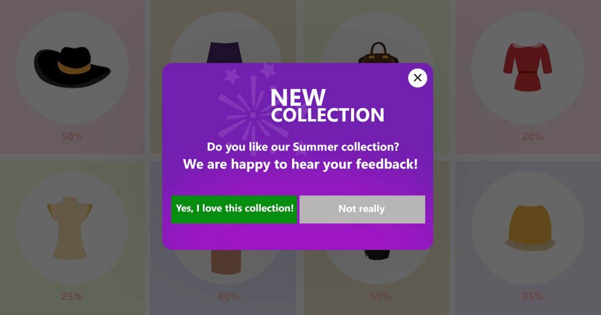
One of the most effective and optimal ways of asking/collecting customer feedback still remains popups. The implementation of Yes and No buttons can ease your job making the process a “one-click” action. This doesn’t take any effort from the consumers when you ask a simple question that can be answered with one button click. If you have an online shop, ask them if they are satisfied with your certain collection, for example, and see the feedback.
Adult Content Restriction
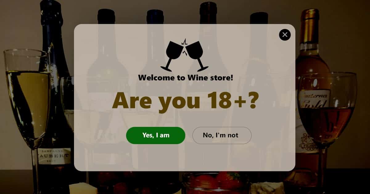
Ever had a thought to add age-restriction protection to your website? Well, this may be necessary if you have adult or prohibited content on your website or on some of your posts. If you have the purpose of making your website to be a trustworthy one, then you should use age-restriction popups to restrict your adult content.
Sometimes the content doesn’t violate any general policies, but may not be applicable to all audiences. This is when you need to restrict the content for a specific audience, with an age restriction, for instance. If you’re running an alcohol or a cigarette online shop, for example, you should think about restricting access to it for visitors under 18. This is a practice that will raise your ranks in Google and bring you more professionalism.
Think about a simple, but yet an easy-to-use and multi-functional age restriction popup․
, which can be regulated by Yes and No buttons. The main purpose of this popup window will be to ask the visitors to confirm their age. And to make perfect use of the Yes and No buttons, you should ask the question so that they will just hit “Yes” if they are 18+, and if they hit “No”, they wouldn’t be able to access the site.
Promoting Your Blog
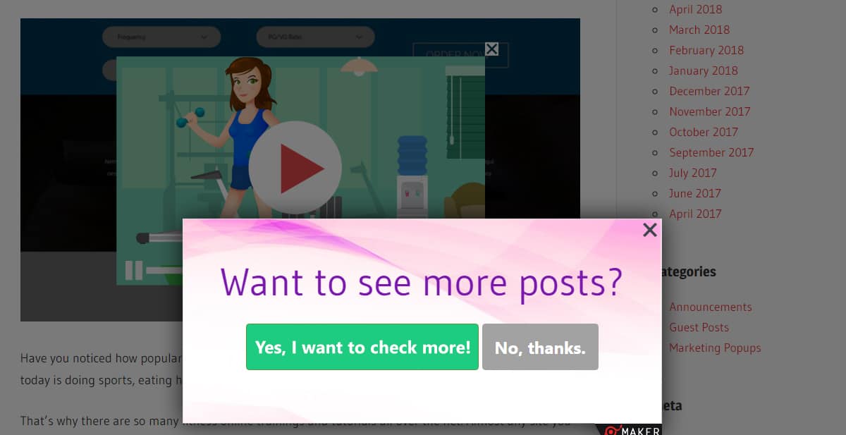
You’re a talented starting blogger full of ideas and hopes to become a popular writer? You have all the delightful content but still, have not enough readers?
You should promote your blog, my friend. Best blogger outreach like guest posting and sponsored posts can be a good means to promote your website/blog using backlinks to your site. But there are other means as well to consider.
Readers come to your blog, read one of your articles, and leave without visiting more posts? That’s abandonment. You will never get more leads this way. Think about pushing them to check out more of your posts, and maybe share them on the net.
The best way of realizing this is using a popup window with Yes and No buttons. You may ask how? How can Yes and No buttons be related to blog promotion? Well here’s how.
First of all, the Yes and No buttons don’t necessarily have to have the texts just “Yes” & “No”. You are free to use these buttons with any text you may wish. It’s up to you!
Now let’s check a probable type for your popup window. It can be a simple question, asking if the readers liked your post. And if they did, they will certainly be eager to check out more of your writings. So here’s when you can use redirection for the “Yes” button, so if the user clicks “Yes” to confirm that they liked the post, you can redirect them to more of your posts, thus increasing the conversion on your blog.
The “No” button is to be formulated correctly too. Be fair to your readers and don’t make any forces to make them read more. You’ll push them back. Provide them with an opportunity to regret your offer (of checking out more posts) and close the popup, if they hit “No”.
This is a great chance for your blog to run more successfully and make you a popular blogger. You’ll see how your blog develops by being true to your readers. 😉
Conversion via Exit Intent
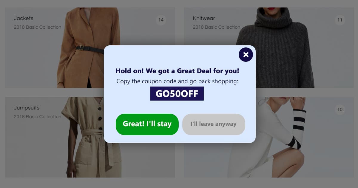
How to keep a visitor from departing from your website not having made any purchases?
Exit Intent + Discount Coupon + Yes and No buttons = More Sales!
This is the ultimate formula to benefit your online trade that will escalate your conversion ratings and cut down the bounce rate.
Gather more real shoppers on daily basis. Use real-time converting exit intent technology to catch your potential customers just the moment they try to escape from your site.
Everyone loves sales. Sales are something really powerful that is capable to attract any shopper. You are probable to bring any user back if you have a good deal to offer. So when the user tries to depart from your website in a rush, not having bought anything from your store, this is the exact time to show the super offer on exit intent. Show a special discount code in the popup window and provide 2 buttons (Yes and No) to finalize the deal.
As cited before, it’s not necessary to name the “Yes and No” buttons specifically like that. No. You can add any text you wish on the buttons, just keeping the main idea and their functionality.
Conclusion
We discussed and covered some of the ways of the usage of Yes and No buttons in this article. This is, of course, not all that these magic and multi-functional buttons are able to do.
There are way more use cases for the implementation of Yes and No buttons. It’s all up to your imagination, depending on what purpose you wish to use them.
These basic 5 ways of the usage of Yes and No buttons inside popups are fairly enough to boost any website’s conversion rates in the easiest way.
Start raising your site conversion ratings right now. Regardless if your aim is to protect adult content on your site, promote your blog, or collect feedback on your service. Yes and No buttons are here to switch any potential customer, the reader to your true users.

