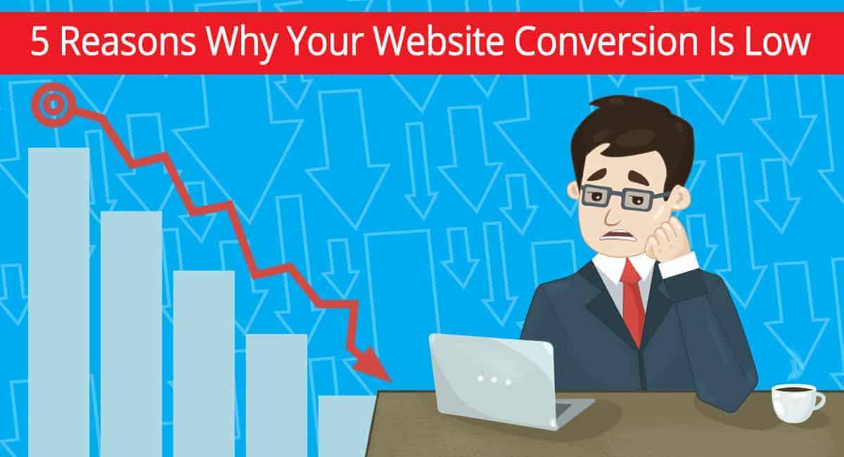
Nothing can make a web page owner feel poorer than seeing the conversion decreasing. Some things have definitely gone wrong during the commerce and web page construction process. There are dozens of aspects you should contemplate to yield the conversion exhilaration on the site you’re operating on.
Many tricks and methods are known to lift the converting rate on the site in case you have faced such an irritating dispute with your site. So, don’t worry things are easy to improve, just check all the viable schemes to improve the miss.
Online popups can be the healing pills for your web page in the mission of lifting your site’s converting rates. The great range of popup types and components are there to assist you in such cases. The utmost pieces of components will quickly revamp your web page’s conversion.
Enforce the online popups in clever manners and the outcome will markedly surprise you! Keep some handy crafts of popup usage in your thoughts and get the maximal output on your site.
Your web page will develop at a rapid speed and your sales growth will amaze you with a high level.
First Blush
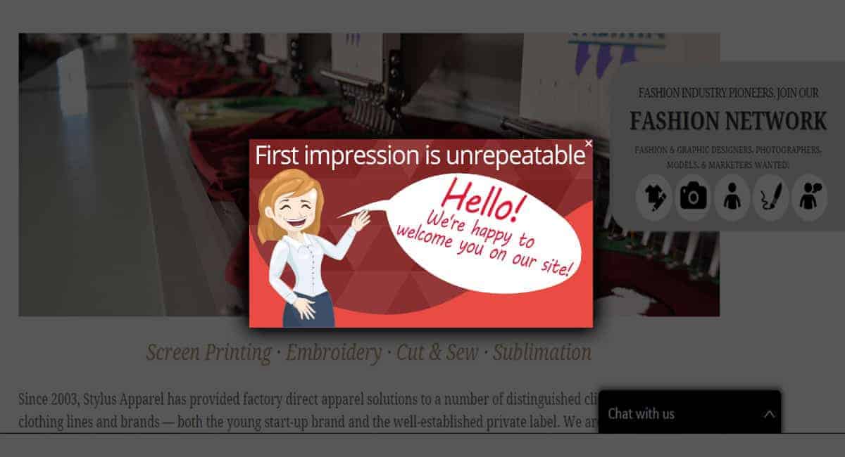
You can never repeat the first blush. If you’re ruling a web page, think about the presentation carefully and consider all the littlest aspects to make the finest first blush. Make your web page look as welcoming as possible. The components of the total look and impression may include the web page colors, the structure of the site – make it as clear as possible.
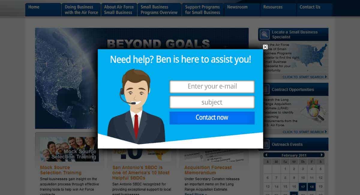
One of the most fascinating tools to provide a fine first blush on your site newcomers are the online popups. The finest way to deliver your message to your site newcomers. Include anything you wish in the popup window to make your word as powerful as possible.
Create and implement a popup on your site to share the ideal first blush and charm your site comers at one blow.
Add a welcoming image in the popup, it can be the image of your team members, or a cartoon-like one. The chief requirement in this case is to pass a positive effect on the viewer.
Besides the image, you should add a creative and motivational text to allure your users at once. Just tell them you’re happy to welcome them on your site, this is enough.
Familiarity
Know your audience well and you’ll achieve better heights in your path to success.
Website owners very often lose their positions being less informed about their audience.
Especially in the case of online shops, familiarity is a very vital point to consider.
The conversion ratings can fall at a rapid speed if you’re not concerned about your site
shoppers.
A perfect solution is separating your stuff into categories according to age groups, sex, and
seasons. It’s a very much welcomed practice, and the shoppers do like seeing products divided
into categories.
Use analytics for each category page on the site and use the statistics to display targeted offers to your
shoppers.
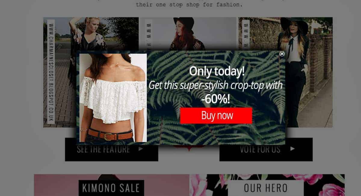
For instance, if you see that the statistics of the visits of ladies’ summer collection is higher than the rest of the categories, you can make a super attractive proposal on your site for the specific groups of your shop.
Take a very popular summer clothing item, a crop-top, for instance, and offer a discount for that one
item.
The discount offer can be shown in September, to provide guaranteed sales. This is the perfect time
for making sales on summer items. Just make sure the discount is enough convincing for the shoppers to make them buy the crop-top in autumn. 🙂
Once again, a great way of showing the discount offer would definitely be a beautifully constructed
popup, shown on shopping pages, for once per shopper.
Mobile Responsiveness
Web page owners sometimes forget about the view on the mobile of the sites. You must contemplate all the aspects of your site to make it as responsive as possible. It should fit any screen size and don’t lose the look in resizing. On the mobile screens the site should be easy to regulate and should be as clear as possible.
When it comes to the usage of the online popups on mobile devices, it’s vital to contemplate a lot more not to irritate the visitors. As on a mobile screen it’s much harder to access the page when a huge popup appears and you can’t seem to close it. This is why you must encounter such tiny aspects to have an appropriate web page for any screen view.
A couple of crafts will help you to apply proper and not irritating online popups on your site, for mobile gadgets.
- Set some opening delays for your popup on mobile gadgets. The users will like the idea of not seeing a popup just after landing on your site.
- Use popup dimensions that will cover not more than 50% of the screen. The viewers should be able to see the web page stuff when the popup opens.
- Add a popup that will surface when the visitor clicks on a button. This is the best praxis, actually. If they wish to observe your proposal in the popup, they will open in themselves.
- Make sure the close button is visible and functional enough, so if you’re showing a popup the viewers can immediately close it if they don’t need it.
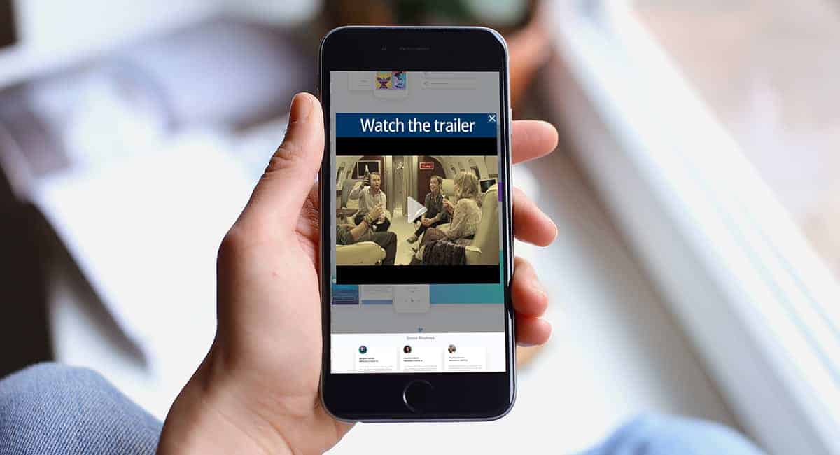
Let’s say you own a movie’s web page, where people watch films online. What could be even more useful than showing the movie trailer in a popup? Construct a Video popup, make it clear, add it on a button, like “Watch the trailer” and provide users an opportunity to check the trailer before starting the movie.
Use Quality Images
High-quality images are invariably adorning the view and they really add some weight to the stuff you’re representing. So, if you really want to have a fancy look on your site, you just have to include high-quality images on your site.
We have to admit that low-grade images are turning the look less attractive and are decreasing the serious effect of the site.
Pay greater heed to the colors and the resolution of the images on your site. They have to be delightful to the eye and should allure the viewers.
The same refers to the online popups on your site. They are the pieces of the stuff on your site, and they must as well be quality constructed to have their input in increasing the conversion on your site.
So, if you’re planning to include online popups on your site, you must acknowledge that the images in the popup are no less vital. Implement high-quality images in your online popups to be pleasant for your site guests and promise a converting upgrade.
Even if you’re using a Contact form popup type to become reachable for your users, you should contemplate adding alluring, quality images to make it even more attractive and hike the odds of reaching out to your viewers.
Clear CTA Buttons

The clarity in everything is always evaluated. Do your best to make your web page content, your offers, and your design every component on your site, as clear as possible. Your web page is supposed to be easy to understand for all the viewers. Encounter every single detail to make the site maximally straightforward for all the viewer categories on your site.
It may sound rude, but you should structure your site so that even the dumbest viewer can understand the point. Put all your efforts, make research to be as understandable for your viewers as possible.
The same relates to the online popups on your site. If you’re using any popups that contain call-to-action buttons, ensure your button texts are clear as well. Besides the overall capacity of your popup, that must be clear as well. You must pay greater attention to the clarity of your call-to-action buttons. Double-check that the text is easy to read and check if it’s on point. So if a user sees the button, he/she understands at once what’s it for. I mean, there are many cases where you see a button and can’t really understand what will happen if you click. This is misleading and very bad for your site conversion. So, if you’re offering something to your users, make sure they understand what the buttons will bring to them on click.
Conclusion
The conversion rate is the essential point of any web page. The goodness of your web page is defined by the conversion rates. You can have a beautifully designed web page with a blog section comprising lots of articles, but if you don’t encounter some essential points to make it SEO friendly and responsive for your users, your whole work will become in vain.
That is why you must know the methods that will turn your web page extra converting and intelligently structured to bring you more profit. Verify you are ready to make the finest first blush for your site newcomers, this can be vital for your conversion.
Pay greater attention to intimacy with your devotees. Make research and investigate the inclinations and tastes of your site visitors to propose to them things they will like.
Don’t forget about the responsiveness of your site on different devices. Do not limit yourself to the perfect view and functionality on desktops. Make sure the site looks and functions on other devices as well as on desktops.
Quality comes first in any field, in any project. Provide quality in everything you do. The images you use on your site should be so good to allure your viewers and engage for actions lucrative for you.
If you have call-to-action buttons on your site (in the popups), check their clarity of them. Make sure the texts on the CTA buttons are clear to understand and work in their aim.
In other words, if you want to increase the conversion of your site, you ought to simply be serious when taking steps in structuring the site. Investigate, make research and do your best to provide the best quality for your users. This way your conversions will rapidly rise up and you’ll have many extra proceeds with your site comers.