A successful landing page that converts is not so hard to achieve. Your products, regardless of their quality, come after your landing page. In other words, if you have high-quality world-changing products on your website, you should first work on your landing page to be able to sell them. A convertible landing page is the one that attracts and at the same time persuades your website viewers to buy from you. Here, the importance of knowing how to increase the conversion rates comes into the light.
What is a Landing Page?
Your landing page is not always your homepage. It is the page that you choose for adding your products, starting your campaigns, etc. Your landing page is where your generated leads will visit. So, it is totally on you to prefer which page to choose as the entrance of your generated lead. A successful landing page is one that increases your website traffic which can later lead to more sales.
The right combination of different website elements can create a successful landing page. The perfection of such a combination depends on the strength of your ideas behind the design and function of each element. If that is a challenging part for you, you can choose a landing page template from the available samples on the web and customize it to the style of your business. Landing page design is not the only determinative element but still, it is profoundly effective.
Remember not to complicate the design so that your visitors find your landing page too distractive to find what they actually want. A simple and clear design can make each element of the landing page bold enough to be taken into account.
What is the Function of a Landing Page?
The function of a landing page is to facilitate the purpose for which you have developed a landing page. If it is the page where you have displayed your products, it eases the process of shopping for the ones who like to buy your products.
What Are the Elements of a Successful Highly-Converting Landing Page?
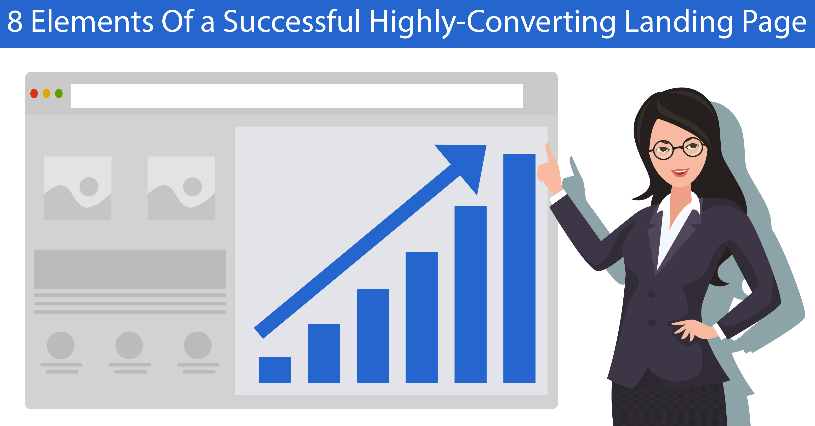
Here are the 8 elements necessary to build up a successful landing page:
1. Inviting Headline
An inviting headline is the one that captures the attention of the newcomers to your website. It should be something that is in line with their interests and gives them a better clue about the concept and content of the landing page they are in. Moreover, it should be catching enough that prevents visitors from exiting your website.
Your headline has to have an ideal length and be persuasive, clear, and to the point. The best number of words for the headline is around 10-20. Do not risk to have a longer headline because the intolerant modern users cannot find that interesting at all.
2. Visual Content
Always keep in mind that a landing page is not fully textual like an academic essay or a lengthy article in a newspaper. It must include some visual content to aesthetically influence your visitors. This task can be done through digital marketing strategies. Visuals can be divided into different categories such as photos, graphic designs, infographics, illustrations, videos, etc.
In case of preferring to add photos, choose large, relevant, and high-resolution images for your landing page and create a great first impression on your visitors. This will make them stay and keep on reading your textual content.
3. Textual Content
Your copies or textual content are as important as visual content. As you might have already noticed, content is the king in 2020 marketing tips. Depending on what this page has to offer to its visitors, the amount of textual content should differ. For instance, if it is a product page, you can add a product name, product description, price, customers’ reviews, etc. Keep the texts short, informative, and interesting to read.
4. Value Proposition
Here, you need to put forth a description of your offers on the landing page. But let’s put it this way you are creating a landing page to express your value proposition. Perhaps you now better understand the significance of the issue.
Promote what you are offering either in text or photos and tell your customers-to-be about the advantages of your offer. In addition, specify what they will get from your offer and what they will lose if they miss it.
5. Contact Details
Contact information should be there on your landing page for the ease of your visitors. Facilitate the process of connecting with you in case of any problems or complaints by adding your contact details. Therefore, your customers can easily find ways they can contact you without wasting their time. In other words, it is one of the elements that help your customers-to-be stay on your landing and complete the conversion funnel.
Contact details contain your telephone number, email address, postal address, and your social media including Instagram. So, you lead your visitors to take a look at your Instagram account, for instance, and you can turn them into your followers. Therefore, in addition to resorting to Instagram follower apps, you can grow your Instagram followers this way too.
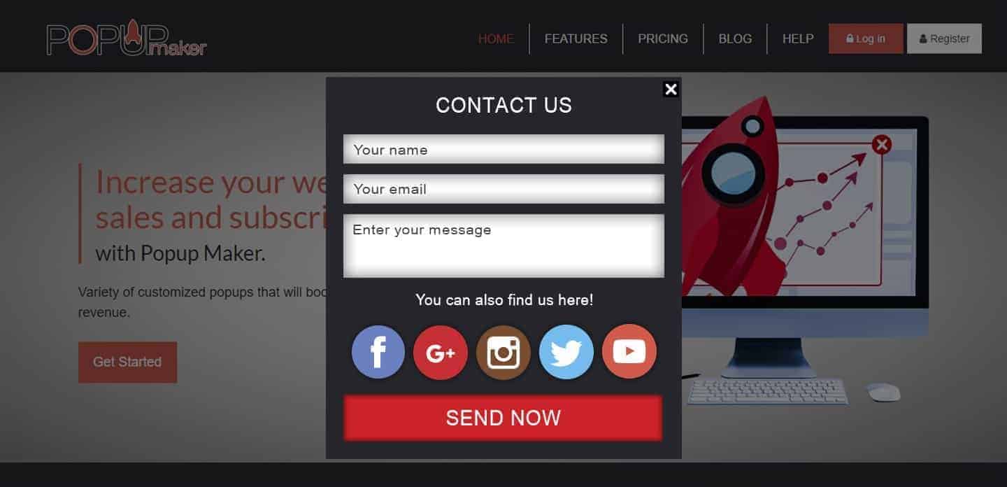
You can also build a contact form with a text box and add it to your landing page. Here is an example:
 popupmaker.com
In addition, a live chat option can be helpful too and accelerates the process of reporting a problem to you.
 popupmaker.com
6. Customer Service
Make the newcomers trust you by presenting the services you grant after the shopping procedure right on your landing page. It highly boosts the conversion rate of your website since more and more visitors feel assured.
Customer service can vary regarding the type of business you have. You can choose between chargeback, warranties, free exchange, or 24/7 online help/support center. You may now ask where to put it on your landing page. The answer is that it would be best if you place it somewhere near a final CTA button. The reason is that it would encourage them to confidently take the last step of the funnel which is the conversion or the purchase.
7. CTA Button
A call to action or CTA button is perhaps the most important element without which all you have done so far would be senseless. The CTA button is the final point in your landing page through which the visitor is converted into a customer.
Your CTA button has to have a strong CTA phrase that your visitors find encouraging and persuasive enough. The size of the button should also be large enough to be found easily. Moreover, the color of the button has to be bright, highlighted, and distinguished.
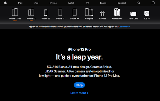
Look at how Apple has used a blue CTA button to prompt the visitors to buy iPhone 12:

Apple.com
8. Exit Popup
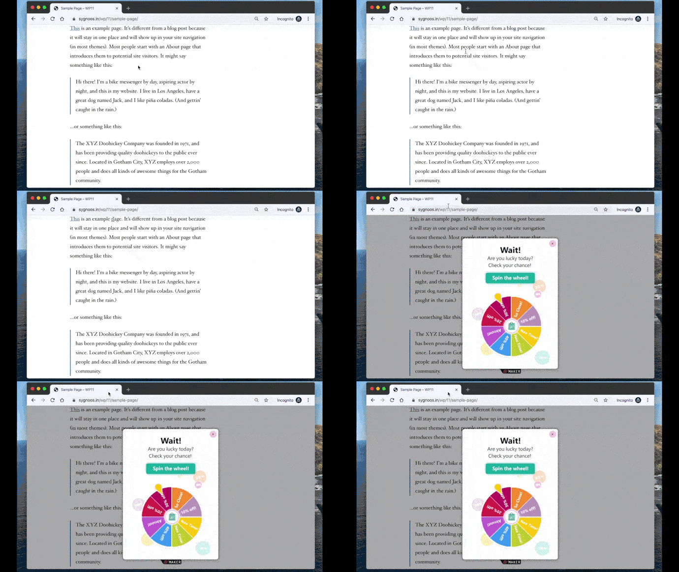
An exit popup is your last effort to keep the visitor inside your landing page. Exit-intent is a popup that appears based on the mouse cursor movement on any page on a website. So, when the visitor moves their mouse cursor toward the close or back button of your page, they receive a popup that prevents them from exiting the page. Create a popup and choose suitable visual and textual content for the popup to keep your visitors inside your landing page.
 popupmaker.com
Conclusion
Taken as a whole, there is no single element that changes a landing page to a successful one. You need a combination of elements to elevate your landing page to a successful one. The 8 elements mentioned above are the most important parts of your landing page that you have to focus on. One last advice: Never forget to test your landing page to see if everything is in place and is working properly. Best of luck!
Bio
The article was written by Parichehr Parsi, a born writer, and a freelance copywriter in the fields of travel, fashion, and Instagram marketing. She currently writes for SocialPros and online magazines in Italy and loves reading, writing, and researching. Find her on LinkedIn!

