You may think creating a Contact form page is the easiest thing to do. You just use some form, add it to your page and that’s it! Practice shows that this is actually, not as simple as it may seem to you. Many aspects are there to be encountered when creating a Contact form page for your website. Keep in mind that a dynamic Contact form page design should be composed to encourage more users to contact you and enhance your conversions.
No matter what type of a website you have, be that a blog, an eCommerce website or any other type, it’s important to think about the Contact form page deeper and more detailed. The importance of using a Contact form on your site is that it provides your users an opportunity to communicate with you in more private basis. It’s a proven fact that this builds confidence along your visitors and boosts your sales (in case of an eCommerce website).
Let’s check some important points to design a perfect Contact form page! 😉
Make the Contact form more personal
Adding a Contact form to your site is actually a great step forward to providing good customer service to your visitors. But, as mentioned previously, there are many tiny things to consider when building Contact forms.
Let’s check the usage of Contact forms in a popup! This kind of page is the most profitable, as practice shows. People are more likely to contact you through a contact form popup, rather than a form simply added to a page. It can be an on-click popup, with a text, like “Click here to Contact us!“.
Pick the best customizable popup software to make the most optimal contact form for your website.
So, what do we understand by the “personalization” of the contact forms?
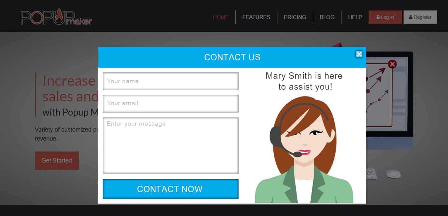
One of the greatest tricks in personalizing a contact form is adding an image of one of your customer support specialists to it. This makes your website popup more attractive, and, eventually builds some trust between you and your visitors. Don’t you think it’s good to see who you are contacting? 🙂
So, take into count adding an appropriate image of one of your customer support specialists in the Contact forms you provide!
Contact form + Newsletter updates
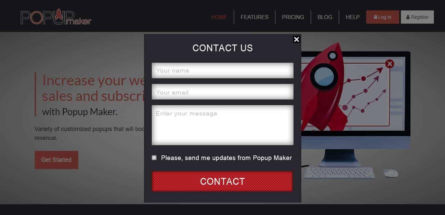
Another great trick in making the Contact form more productive is adding a subscription button to your form. So, if someone contacts you, can automatically be added to your newsletter and will get all the updates of your website.
Another important tip you should consider using this method of Contact forms, is to provide users the opportunity to choose. We always encourage our readers to provide selection options for the users. They need to have something to choose – no obligation is welcomed!
Add a checkbox near the subscription button so one can easily choose whether he/she wants to receive updates from you or not.
Make your Contact forms Socially available
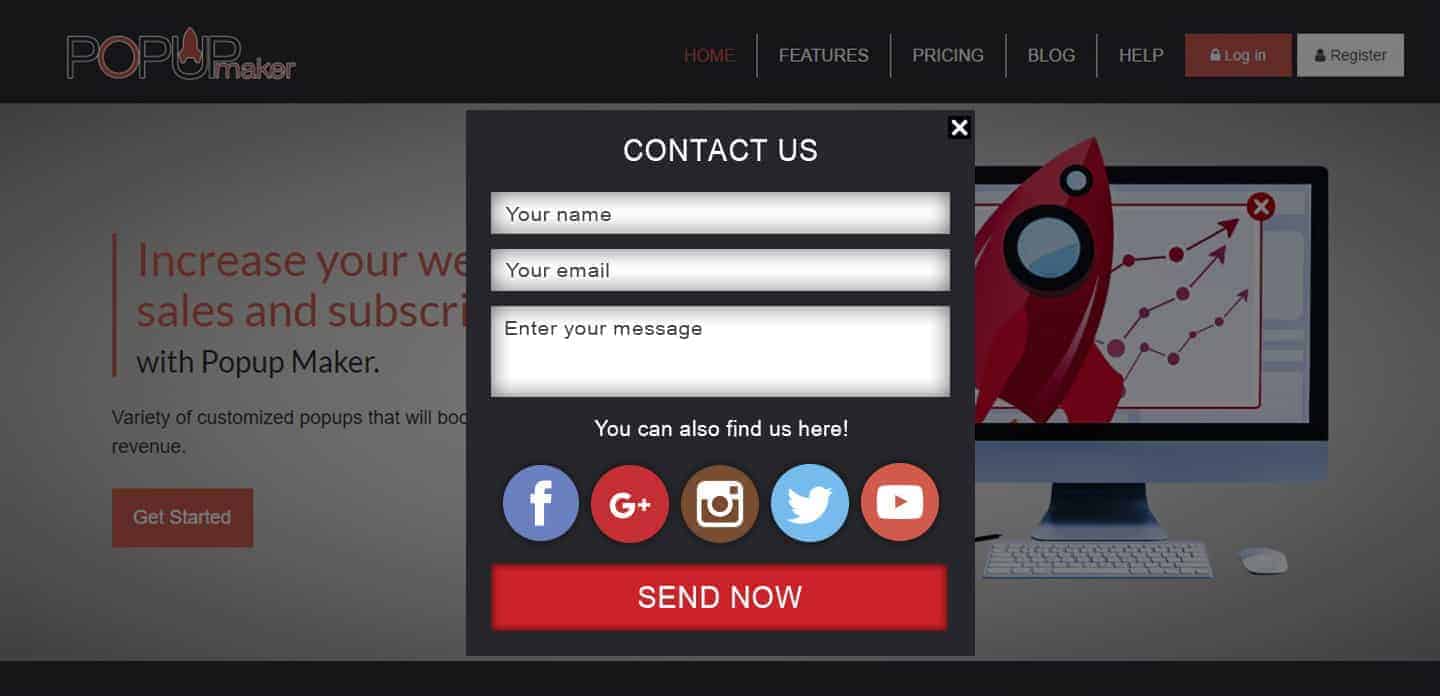
Besides constructing a beautiful and clear Contact form, you should think wider and add more options of contacting you through the popup.
What’s the best way of sharing your content and making it more popular? Social networks, of course!
There are no doubts that Social media is the best and the fastest way to contact someone, share some content, and simply become popular. It provides opportunities for faster and more efficiently engagement to your users/visitors.
So, why don’t add some social icons in your Contact form popup, sharing your profiles on social networks like, Facebook, Twitter, G+, Instagram, etc. ? Add the icons under your form, so the visitors will have more options to contact you through the networks provided!
Add your address and a map
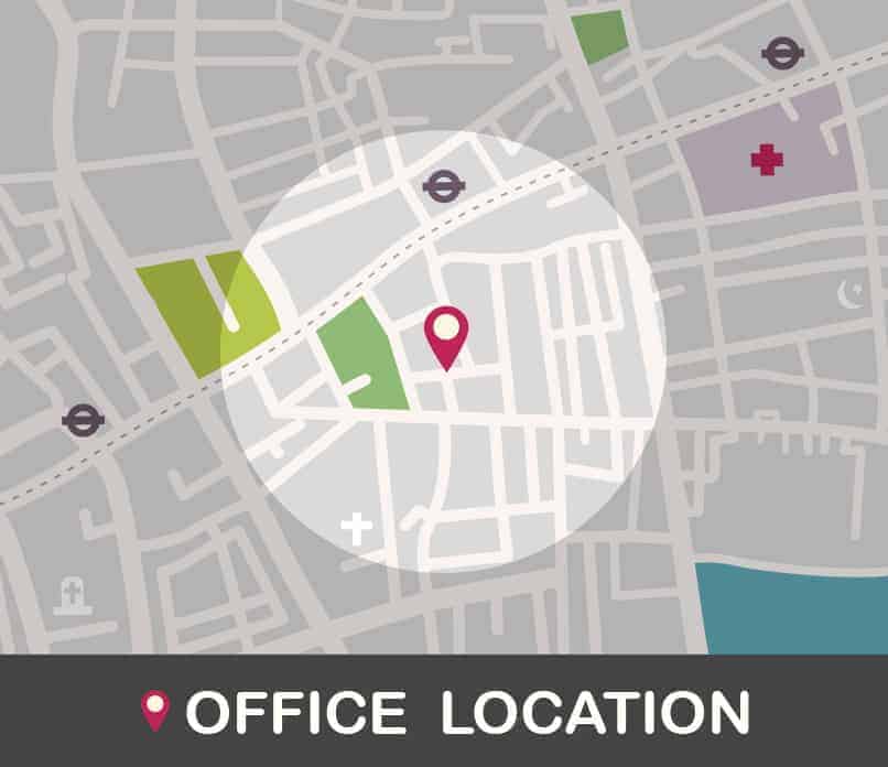
Including a map and your address on your contact form is the best way to grow the visitors’ confidence in your online business. This concerns even those online business owners that don’t have a real office and work only on online basis. It’s good to mention your location, so the visitors may see where you’re located on Earth! 🙂
But, if you have an office, or offices, it’s kind of a necessity to not only mention the address, but also show your location on a map. This will help your visitors get your directions better visually and obviously, they will trust you even more!
And, to sum up and conclude our today’s post, I’d love to show you some live example of a Contact form popup, created via Popup Maker.
Click Here to Open the Contact Form!

One comment