
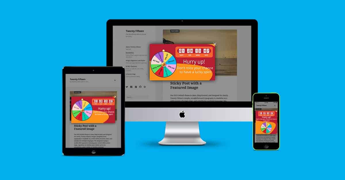
Popup Maker announces a 100% responsiveness with the new update in the service. Now you can have perfectly responsive popups ideally suiting any screen possible. No matter you display your website on a mobile screen, on a desktop or on a tablet, you’ll have a perfectly looking popup on any of them!
Run beautiful online marketing for your website and for your store to get the best revenue possible, increasing your website conversion rate.
Use this amazing feature to increase your website conversion rate 100 times and become the best provider in your field.
What’s responsiveness for a popup and how can it affect your website conversion rate?
Responsiveness is one of the chief characteristics that can be decisive for the success of your website. If you have a popup for a specific offer and it doesn’t look good on a mobile version, for example, this will certainly push your mobile users away. Consequently, you’ll lose another number of new users. As your ugly popup won’t attract them in no way, this is just not professional.
You might think, “well, I could simply remove the popup from the mobile version”. Well, this is not the best decision, my friend. Most people are now hanging on their smartphones. And there’s a less number that uses computers rather than mobile devices for such purposes. It’s just quicker and they have access to all the news in any period of the day, wherever they are.
So, think twice if you consider the mobile version of your website less important. In fact, mobile popups can bring more results for your website conversion rates, if they are used cleverly and proportionally enough.
What has Popup Maker to offer and surprise with?
Breadless responsiveness options! Popup Maker is here to offer you all the possible ways to provide you with the best responsive popups to increase your website conversion rate.
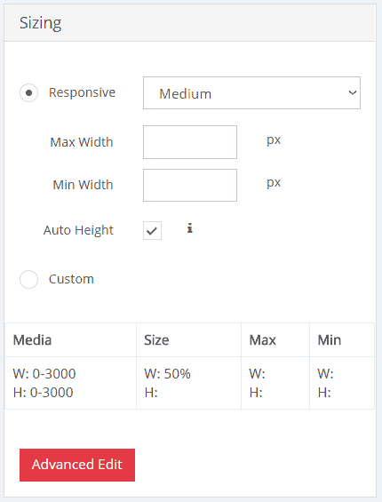
1. The first option is simply selecting the Responsive mode in popup sizing and picking up the size of the screen you want to show the popup on. Selecting a Max Width and Min Width will help you keep the proportions in any condition. If you check the Auto Height option, the height will be calculated according to the height of the screen on which the popup is shown.
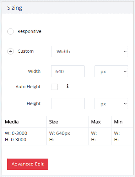
2. The second option is the Custom mode of the popup sizing. You can set the custom sizing for your popup, to fit the exact desirable proportions. We should also mention the Height option for the popup. If you uncheck the Auto Height option, you’re free to select any custom sizing for your popup height. (this option is also actual for the Responsive mode)
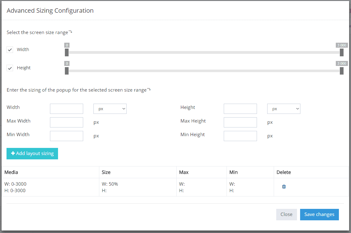
3. And the 3rd, very custom sizing option is the Advanced one. This is the best option to play around with the sizing proportions in the most detailed and custom way. You can pick the screen size range for your popup and add the sizing according to the specific screen size range you have picked. This can be done several times, for different screen size ranges.
Conclusion
Excited to have the most responsive popups with Popup Maker and push your website conversion rate to the sky? Don’t waste any seconds and get ready to start the best popup marketing with responsive popups of Popup Maker. Create beautiful popups and show your offers, videos, subscriptions, and sales promotions with spinner popups (and many more) right now! Use the powerful options that Popup Maker offers and have extra responsive popups on any screen possible! 😉
One comment