Pop-Ups still show us astonishing results, not only for eCommerce but for any kind of website. If you are here, you are probably eager to find new creative ways to generate leads for your business and drive sales. You might have a whole digital marketing strategy that backs up your business, but how focused are you on popup design and its role on your website?
With the wide variety of choices that customers get nowadays, it becomes harder and harder to get their attention and retain it for a few seconds. You need to apply innovative tactics to your popup design in order not to annoy your users and eventually put them on the path to a purchase decision.
We are here to guide you through a new journey of creating stylish and sophisticated designs by making your pop-ups stand out and look creative. We guarantee that your visitors are more likely to notice those and take action.
So let’s dive into the variety of best website popup designs!
1. A photo of your community
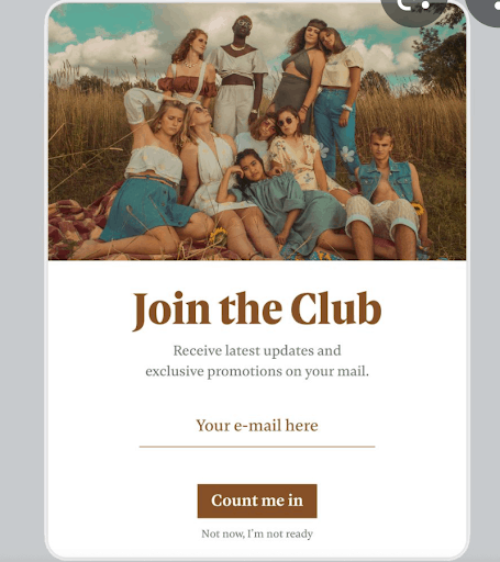
Some companies have difficulties portraying the products in their pop-ups designs, so why not use pictures of your community?
Customers love to see who stands behind the brand, and the fact that they see an image of real people who trusted the company already makes them feel safer. Make sure the photo transfers positive energy through the screen as you want your customers to strive to get the same emotions.
2. Gamification popup design
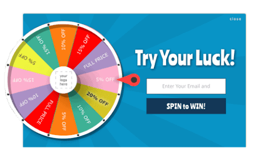
The fun popup design is always engaging. Games are something we were excited about during our childhood, and believe it or not, the emotional spectrum that we got at that time still lives on in us. Most of us still enjoy gamification in different aspects, even if unconsciously.
You can totally change your pop-up design from being function-focused to human-focused. Just apply some gamification techniques. Inserting gameplay elements in non-gaming settings enhances the user engagement with the offer you present on your pop-up. By weaving suitably fun features such as leaderboards and badges into an existing system, designers tap users’ intrinsic motivations.
Believe us, your users will love a spin-to-win appear on their screen and it can become your key to success once you implement it for your Exit Popup.
3. New shapes with PNGs
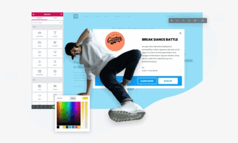
A few easy steps to get a very sophisticated result that truly pops out!
First, you use a .png image as the background, then set the background color of your pop-up to transparent. Voila, you have a very unique pop-up shape. The actual shape of your pop-up will still be rectangular, but as you have set a transparent background, you got this new look and feel.
Pop-ups can require many different design elements to consider, but they will start generating leads on your website once you get it right.
4. Hand-drawn elements
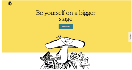
You may have noticed a trend of implementing hand-drawn elements into website designs.
Have you seen these appear on the navigation bars or different other accenting features? Try incorporating this idea into your popup design; however, be cautious when implementing hand-drawn elements into your designs. Make sure to include other details as well. If you make everything hand-drawn, you are risking losing this game.
5. Expressive typography
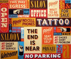
This is an art form where the visual communication is supported by bold text, which becomes the image itself. Here you can experiment with striking contrasts of size and position of type to impart a message.
Let’s remember the vintage covers for the albums of the music bands. Bold typography that attracts the eye immediately. Just make sure to help the viewer differentiate the importance of the information you convey by showing different font sizes.
6. Gifs/Animations
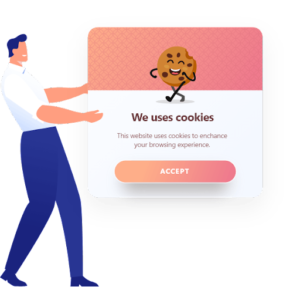
Let’s add some movement to your website to make it more dynamic and exciting for your users. There are so many modern techniques for that, and animated graphics are one of the easiest ways to add a bit of interactivity to your pop-ups.
The implementation of Animated GIFs in web design continues to be a trend, so successfully and creatively integrated animated GIFs will only make your pop-ups stand out! With a bit of spark of creativity, you will be able to animate both your product and service; nothing is impossible here.
7. Transparent gradients
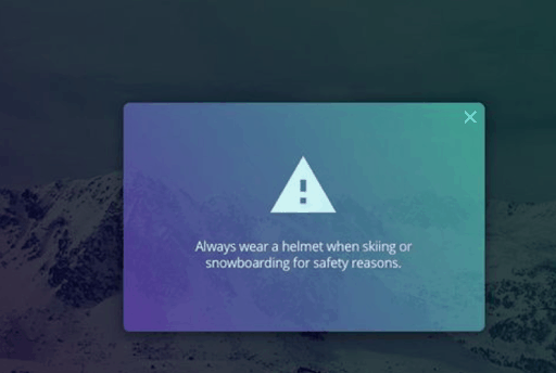
Transparent Gradients are officially back. Starting from the day that IOS 8 was launched, people started sympathizing with transparent gradients again.
There are many ways to experiment with gorgeous semi-transparent gradient overlays that slightly hide the background and soothe the appearance of your popup. This kind of design will never overwhelm your users as it looks very sophisticated since it is half-transparent.
Your transparent popup design will surely compliment the homepage background. Just add some fancy animated icons, and you will be pleased by your website aesthetics.
Conclusion
Thoughtfully designed pop-ups will always perform better than unoptimized ones. Think of your pop-ups design as your marketing sidekick, the superhero that boosts conversions and drives sales.
Try to use some of the principles that we suggested and track the conversion results. Once you see what a difference it makes, you will become addicted!
While trying to implement the best website pop-up designs, always remember to make it match your website and brand identity.
Start creating your custom popup design now and stay tuned for more tips!

