It’s not a top secret that most people find the idea of a website popup annoying and frustrating. This is because they’re not well-constructed and are not smartly used. So, you should design them carefully to avoid any kind of popup mistakes.
On the other hand, it’s a known fact that website popups can have a huge impact on the development of your eCommerce business. The chief idea is about using them correctly and constructing them smartly enough to convert more customers and increase your income making sure no popup mistakes are made.
There are many details and aspects you should consider adding a website popup to your website. Popup mistakes may be crucial to your business and website. It’s better not to have a popup on your website rather than have it used in the wrong way.
Let’s check some major website popup mistakes and find ways to avoid them and get more customers!
Not beneficial offers
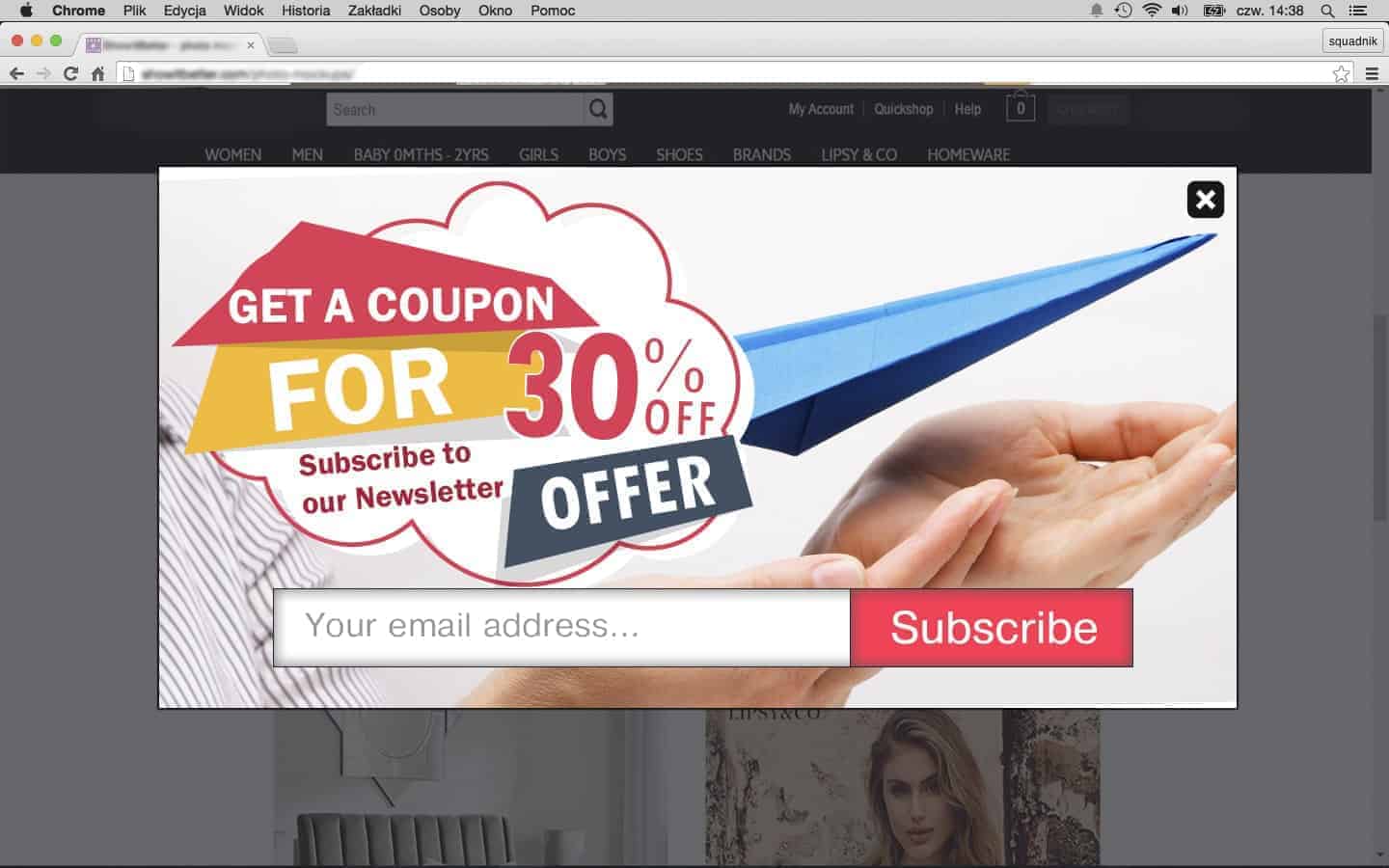
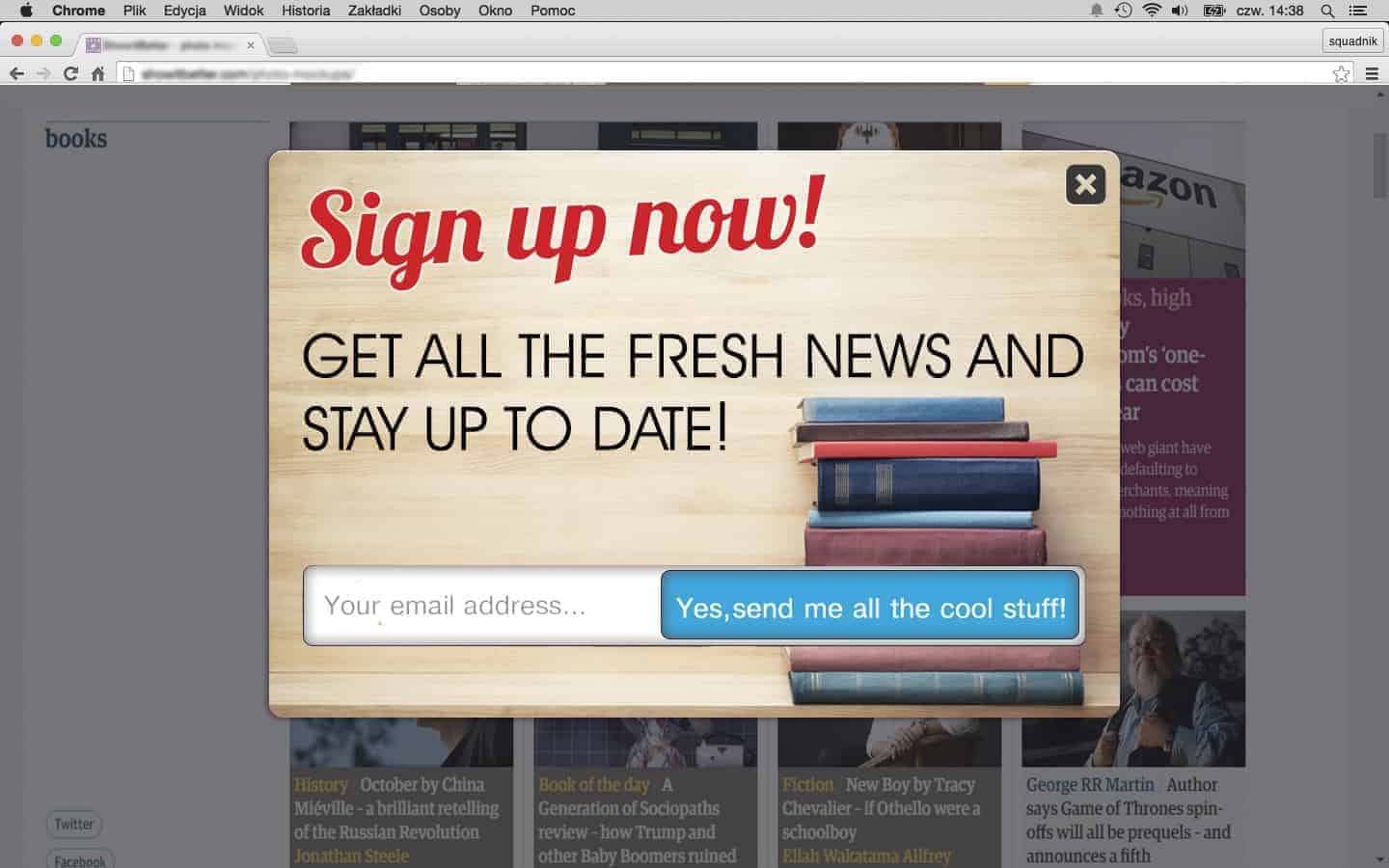
You should have something to offer your visitors when asking them to subscribe to your newsletter and provide their emails. No one is eager to subscribe to your newsletter if they gain nothing as a result. You need to have interesting and encouraging promotions so they will be keen on subscribing to your newsletter.
Let’s say you show a Subscription popup, which is just a form asking them to subscribe. This is not encouraging, is it? People will simply close the website popup and deny your promotion to subscribe as they’ll think, “What will this give me?”.
So what shall you do in this case?
Make a Subscription popup, and include a discount coupon code that the customers will get after they subscribe to your newsletter. If a customer sees that he/she will get something really profitable if they simply subscribe to your newsletter, they’ll doubtlessly subscribe, believe me! Why not subscribe if you can get some discount as a result?! 🙂
Do not interrupt your customers in vain
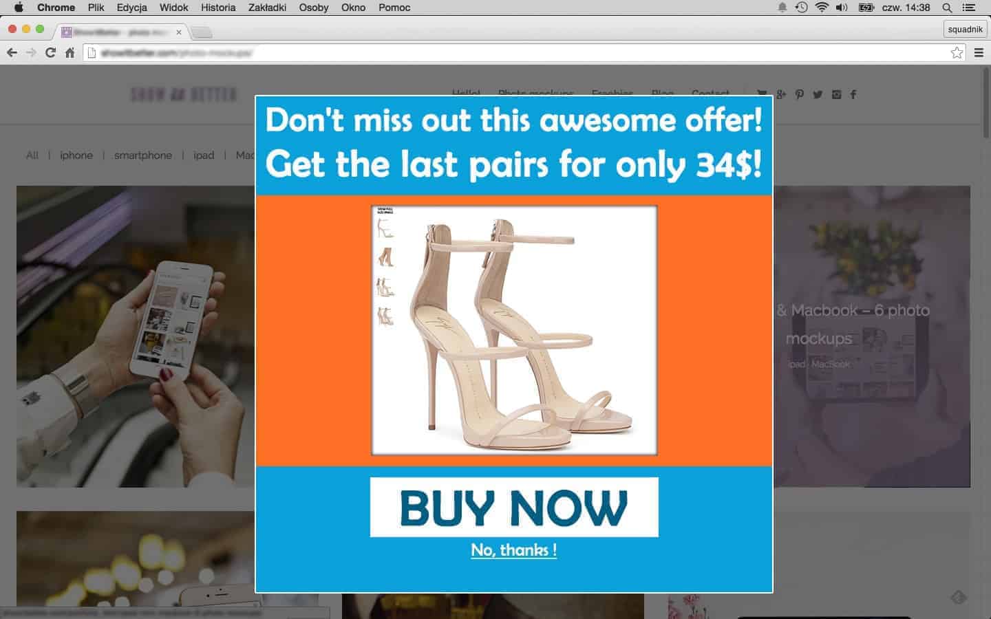
Popups triggered on exit intent are generally very useful and almost not frustrating. But, again, you should know how to use them to have profit as a result. Do not show an exit popup every time a user tries to leave your site – this can be annoying. Do not show the website popup on all your pages. It’s better to show it on your product pages, to get their attention and make them complete a purchase before leaving the site.
Imagine, you’re on some eCommerce website, looking around, checking new items, and can’t decide on making a purchase. You try to leave the site, and suddenly, a website popup appears telling you not to leave so soon! This will definitely make you angry – you couldn’t find something to buy and then, this annoying popup appears! 🙂
That’s why you should think deeper before adding an exit popup to your website.
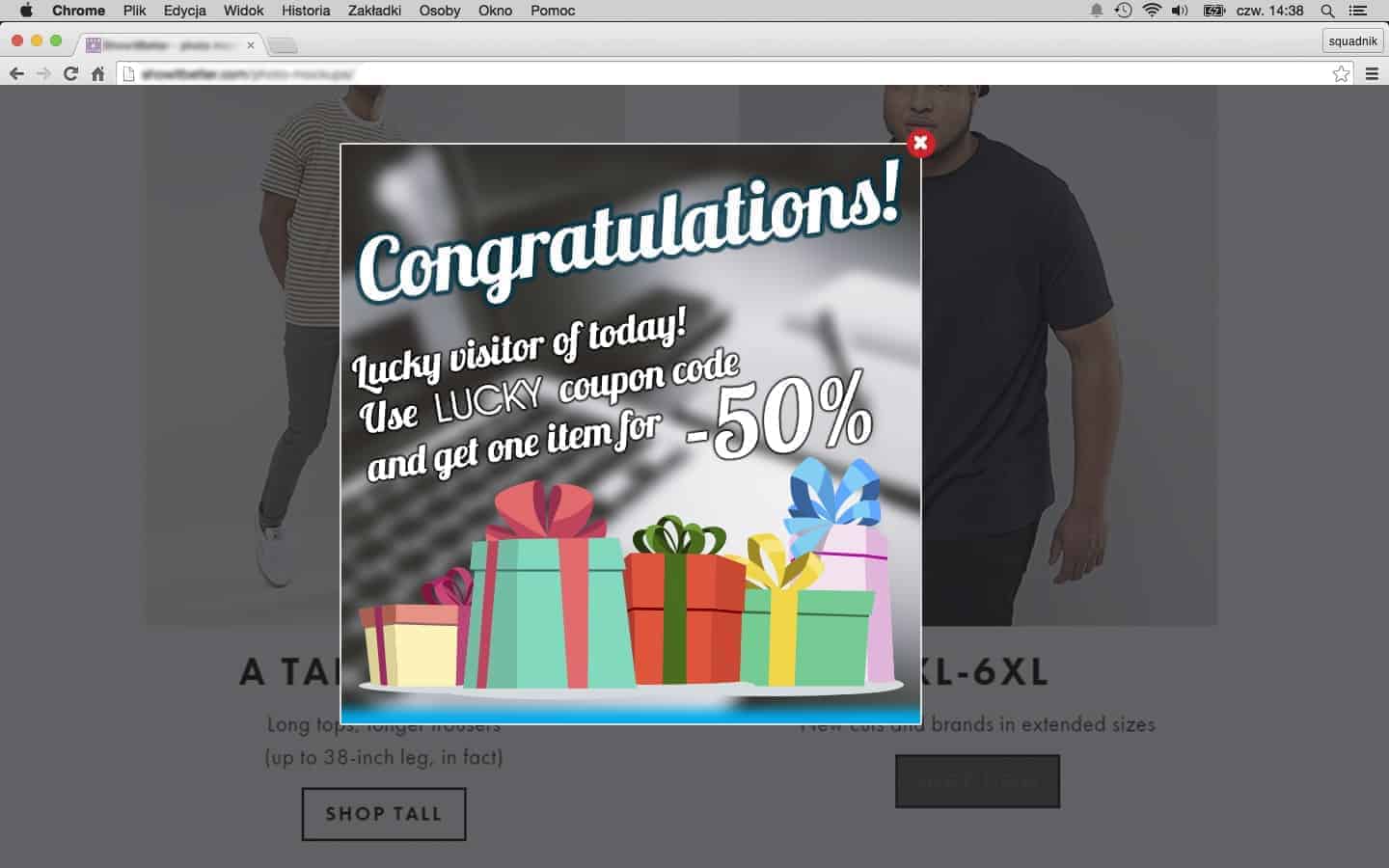
A great solution would be showing a fascinating offer that would not make the visitor angry for disturbing them.
You can show a special offer to get the last piece of some of your products at a lower price, for example. This will interest your customers and maybe they’ll decide on a purchase at last. 😉
Avoid using long and unclear content
No matter how beautiful and attractive your website popup is designed, it shouldn’t contain too much content. This can make users get bored and they won’t be interested in checking the content of your popup. If a website popup opens up with a lot of unclear content, no one will read it and you won’t get the result you desire. Avoid popup mistakes like this.
Let’s say you have a subscription popup, asking your visitors to subscribe to your newsletter.
A visitor should know why he/she is subscribing to your newsletter. So, if you simply show a form and suggest they subscribe to your newsletter, the possibility of getting them subscribed is very little. And, on the other hand, if you include some major piece of info about your website and your offer in your website popup, and then the form for them to subscribe, this could be as useless as the one with just the form.
So what to do to make the visitors subscribe to your newsletter?
Be as brief and clear to understand as possible. Ask them to subscribe to our newsletter and mention, what they will get in a couple of words. Like, “Subscribe to our Newsletter and get the freshest news about new arrivals and sales!”
Then, under this text, including the subscription form, a well-designed one, suitable to your website’s colors and subject. A background image would be proper in this case. Include an attractive, bright image to make your subscription form more interesting and attractive for them. Oh, and don’t forget to show a “Thank you for subscribing to our Newsletter” message after the successful subscription- customers like it. That’s it! You’re ready to get more subscribers to your mailing list! 🙂
Pick the right time to show a website popup
You should know when exactly is the perfect moment to show the website popup to your visitors. If you show the popup too soon, let’s say when a visitor just lands on your website and hasn’t had time to look around and check if there’s something on your site interesting for him/her, this will definitely irritate them.
Set a time delay, or add the website popup on your shop pages, not the home page. So you can be sure, that the visitor has managed to get the idea and check the items on your website before he/she sees your offer in the popup.
You may have perfect offers, profitable for both, you and your customers, but if you show them not on time, the results may not be as you expected.
For example, you can show a website popup, offering a discount for one item, whatever they wish. You should wait a bit, to make sure they have had time to see your products and know on which product to use their discount coupon. Set 1 minute delay for opening the website popup. This is enough for the visitors to manage to check at list some items on your site and pick some of them in their minds. This is the very time for the popup to appear and display your lucky offer!
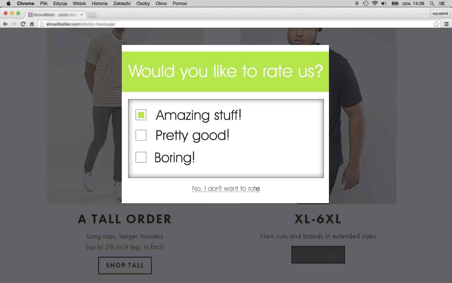
Do not use persevering popups
Always keep in mind that your customers should have a choice! Don’t make common popup mistakes and don’t be insistent and let them be free in their choice. If you want them to rate your products or your service, be smarter and let them decide whether to rate you or not.
Of course, providing your customers an opportunity to rate you, and sharing their experiences and opinion about your service, is always a good idea. This makes you more engaged with your customers and makes them trust the quality of your service even more.
But, deciding to show a website popup asking customers to rate you, it would be good to provide another option, like “No, thanks, I don’t want to rate!” As there are cases where they just don’t find it necessary to rate the product/service at that moment.