There are an awful lot of email users out there. How many, you ask? It’s estimated that the global population of email users stands at around 4 billion. As a business, you probably can’t wait to contact them and make some mega sales!
Hold on. Cool your boots. Of the billions of email users around the world, only a minority actually engage with all of the commercial communications that flood their inboxes. What’s more, when it comes to newsletters, the figure is especially poor. But the good news is that there are ways to entice potential customers to open your newsletters and engage with your brand.
What is a newsletter?
For the customer, a newsletter is a way of staying on top of news and updates from their favorite brands. For the company, it’s a way of staying current in the minds of those most likely to buy their products and services.
It’s a win-win. Or it should be. We’ll come to that.
Newsletters are typically sent out weekly or monthly, or on a timeframe that your business thinks best. They may include sneak previews of upcoming product ranges and special offers.
Newsletters can also feature product stories, or include links to more in-depth data on a specific topic. Whatever they contain, newsletters should be written with care and attention.
What type of newsletter should you send?
Start by thinking about the purpose of the newsletter. Is it a general round-up of what’s going on in your B2B business? Or does it have a more specific message, perhaps breaking down the benefits of a workflow orchestration platform?
It’s often better to use the newsletter to promote a particular aspect of the business. A newsletter that talks only about exciting new products will have more of an identifiable character. This will appeal to a certain type of customer, and your open rate should reflect that.
Be upfront with customers
When you’re seeking to convert website visitors into subscribers, make sure that information about the newsletter’s nature is clearly given at the point of subscribing. This way, you’ll be more likely to have people on your list who favor the kind of mail you’re sending.
Design matters
Designing a newsletter is often the exciting part, and today there’s plenty of potential for graphics that can really grab the user’s attention. However, try not to get carried away. Remember that the best design is often invisible. In other words, if the user is struck more by the look of the newsletter than by what it’s trying to tell them, then it might be a little design-heavy.
Above all, think about your audience. If a particular demographic is likely to feature more than others, then think primarily about what they’re wanting to see from a newsletter.
For instance, I went on a streetcar outing yesterday. I don’t live anywhere cool like San Francisco with stylishly retro trolleys that I can just hop on and off. In fact, where I live, they’re major tourist draws in themselves and people come from far and wide to travel about two miles through a field. And then go back again. Yeah, breathtaking.
Anyway, I was actually very taken with the experience so I signed up for the newsletter. A welcome edition promptly appeared in my inbox, and it looked like this:
You might be thinking clunk clunk clunk went the email. But actually, they’ve assessed their market quite well. People are signing up who just want information on tram (as they’re known here) matters. Nothing else, thank you.
In addition, they will probably be skewed toward the senior end of the demographic scale. This is a sector of the population that tends to react better to simplified interface displays. What we have here is an extremely simple display, incorporating a nice image, a small amount of copy and plenty of breathing space. Beneath the fold, there’s more, including a clear button for ticket sales.
So, when it comes to designing your newsletter, you might want to consider this lesson in simplicity. Or not. It all depends on who you want to appeal to.
Templates tools
Hugely useful when it comes to laying out your newsletter, templates and newsletter tools are widely accessible today. They take a lot of the drudge out of putting a newsletter together and can even make the sending process more streamlined.
Bold branding
By all means, jolly up your newsletter with some imaginative use of your business branding. It can help with theming, as well as giving your recipients assurance that it’s an authentic email and not some piece of phishing work.
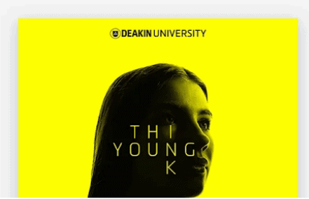
It doesn’t have to be brash. Look at what Deakin University did with a small but striking instance of branding combined with great color and image.

Image Sourced from reallygoodemails.com
Handy hierarchy
You can help your reader access the parts of your newsletter that might be of most interest to them (and perhaps most profitable to you) by using heading hierarchies to clearly show where new subjects begin.
Pretty pictures
As with the example of the streetcar, it’s a good idea to start with an image of what the main area of interest is. We’re visual creatures, and we like a nice picture. Exploit this.
One thing to remember to include is alt text. This is the information about an image that will be displayed if an image doesn’t load. If it’s a purely decorative picture, this isn’t a big deal. But if the image is functional, for example if it’s a CTA in itself, then the alt text will be vital.
Clear CTAs
More often than not, the newsletter’s central goal will be to encourage action from the reader. This is usually buying a product or service, or at least clicking through to your website to find out more about it. So, make sure that any calls to action that are in the newsletter stand out immediately. It may be worth having just one CTA per newsletter. This has clarity written all over it.
Snappy subject lines
Consider an average email user’s inbox. It’s full of messages eagerly vying for the recipient’s attention. You need to join this melee yet stand apart. This calls for originality. You need to be engaging but not cheesy, and avoid coming across as spam.
Subject lines can be hugely influential in your email’s fate. Will it be opened or declared to be spam?
Words that help with the former include ‘weekend’, ‘new’, and ‘summer’. (Bad news for the company that sells second-hand winter workwear.) Words that can indicate that the user might be in the presence of spam include anything to do with money, as well as time-critical entreaties to action.
Studies have shown that 88% of all opened emails are opened within 24 hours. Opening rates plummet thereafter. So ideally, you want to hit on an eye-catching subject line that’s so engaging that the user finds themselves opening the email soon after receiving it.
A great example is ‘A sneak peek for VIPs only’, from Serena and Lily. Examples like this work well because they have an air of exclusivity and make the reader feel valued by including them in an exclusive exchange.
Be ready to adapt
A growing number of people use their mobile devices for accessing emails, so cater to these users by ensuring that your design is responsive. In other words, your newsletter should adapt to the device it’s being viewed on.
Better still, one of the most significant customer experience marketing trends is the rise of omnichannel as a means to reach customers. So make sure that you’re a part of this by adapting your newsletter to whatever channel the customer favors, whether that’s social media, mobile apps or websites.
When should I send it?
The final piece of the puzzle is deciding when to send your newsletter.
It’s been shown that emails sent on certain days of the week and at certain times of day will perform better than others. For instance, those sent early to midweek score better than those sent at the end of the week or the weekend.
It’s also often the case that emails sent in the 7am-9am bracket result in the best opening rates. This makes sense – they’re in people’s inboxes ready for when they arrive at work. Yes, of course employees should be getting down to the business of the day as soon as they report for work, but, you know, other things can intervene. Besides, it’s important to ease oneself into the day, and not to rush headlong into a task.
The next best timing may be between 4pm and 6pm, appealing to those who are just clocking off or on their way home. However, keep in mind that there is no set rule, and it will often depend on your audience. A little trial and error is always worth the effort.
Newsletters that stand out
Newsletters can be super-effective at getting word out to customers and keeping people engaged in your business and its products. But they must be done right, or they can end up just becoming yet another nuisance email. Keep your email relevant, attractive and timely, and that unsubscribe button will stay resolutely untouched.

