Exit Intent technology is one of the finest inventions that could be used for popup triggering. The best productive way to catch someone’s attention and bring it back to your website! Show your offers and convince them to hang on your site to learn more, shop, or subscribe to your awesome newsletter.
What you need to regard when setting up an Exit Intention popup for your site is that you should think deeper about the essence of this popup. It should be something very interesting and engaging, so the visitor will think about staying on your site longer and making some deals superb for you and your business.
This kind of forsaking of a user leaving the site should be meaningful so they won’t think you’re heckling and disturbing them. Any type of popup can be used in this case: an Image popup with a special offer, a Video popup with a useful tutor
Mobile Exit Intention Popup is considered one of the best ways of popup triggering. This new ultimate technology is a powerful way to attract and engage many visitors on your website. Make fascinating and convincing offers, keep your users, and get a lot of sales.
The first thing that you should know of an exit intention popup is to think deeper about the content of this popup. Think and create interesting and fascinating popups to keep your visitors longer and make online shopping on your online store.
You are free to use any type of popup with exit intent such as an Image popup with a special offer, a Video popup with a useful tutorial, a Subscription popup for your newsletter – anything you wish. Just remember to make it eye-catching and exciting! 😉
Make an offer one can’t resist
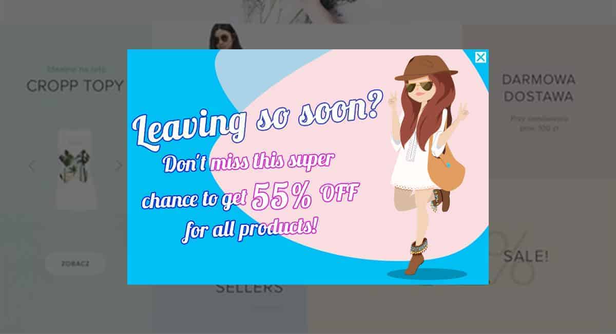
Let’s check an Image popup example, triggered with Exit Intention.
If you have a special promotion for some discount on your products, this is the very case to show it on exit intention popup. Create an Image popup, with an attractive and positive image, add some intriguing text, and that’s it!
The point, in this case, is that the popup should be added to the page where the visitor is fair to shop. Your product pages will be explicitly what you need in this case. Add the popup on all your product pages and the guests will spot your proposal before leaving any product page on your site.
Offer Help
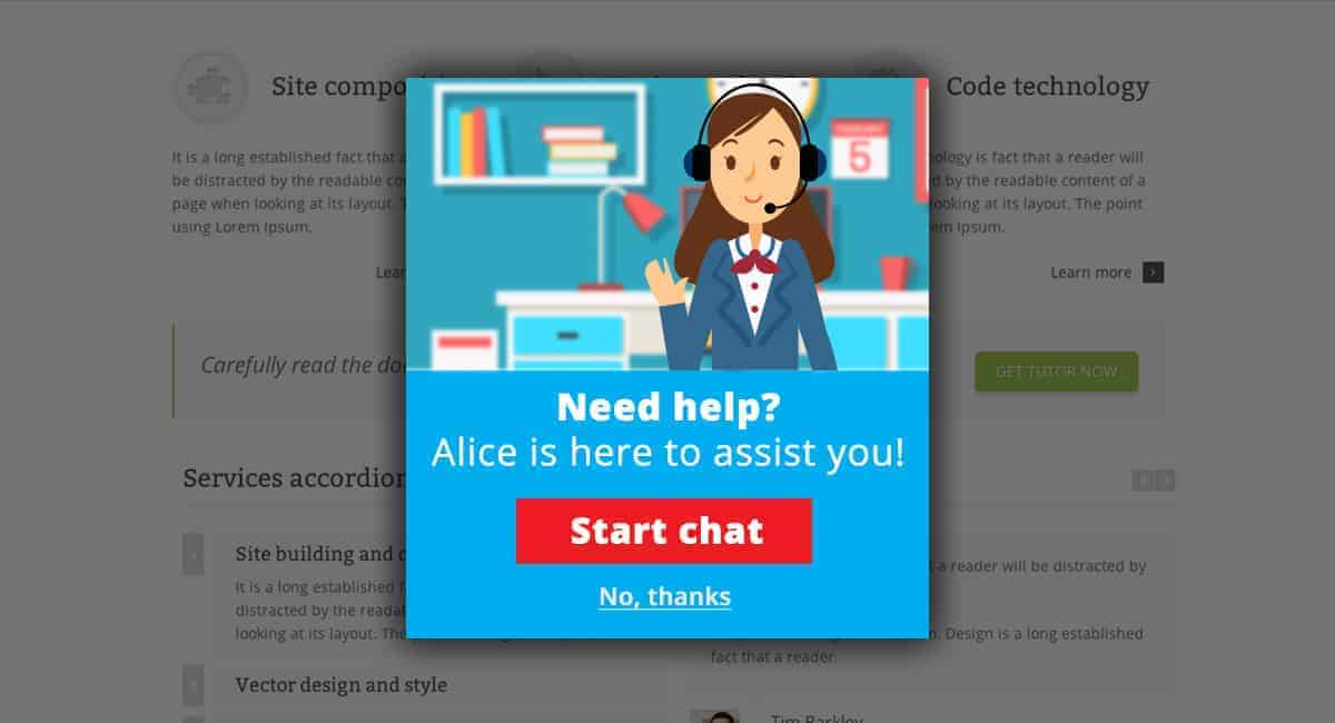
Another great practice of Exit intent usage is opening a popup with a help offer. It can be a live chat offer, for example.
Sometimes a visitor searches around on a page, trying to find things he/she needs on your site, and leaves the site not having success in finding what he/she needed. So when your site guest is going to depart from your site not desperately, not having found what he/she was looking for, this is the very moment to open a popup and offer some help via live chat.
What should this popup look like?
Include an image of your support specialist in the popup. Mention the name of the specialist in the text you are offering your help. Make it personal so a visitor will agree to start a chat. Include a “No, thanks.” button, so if a user isn’t interested in your offer, he/she will have a choice to refuse.
Sign up for profit
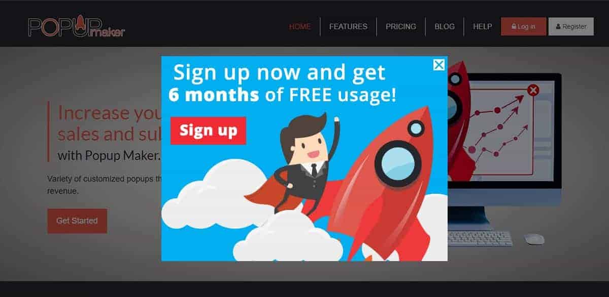
Outstanding offers are always attractive and effective in profit growth. Use them to intrigue your site guests and stop them from leaving your site.
Let’s take Popup Maker, for example. They’re offering free usage for the first 6 months! That’s a great tactic to collect more users, it really is. So a perfect solution will be creating a popup, involving an alluring image in it, adding a “Sign up” button inside with an inspirational text added. The offer is very alluring, of course, but it’s important to think of presenting it accordingly. The result will be much better if you display your offer properly and attractive enough to catch up the attention of your site guest
s at once and make them become your users directly through the popup.
Free items for subscription
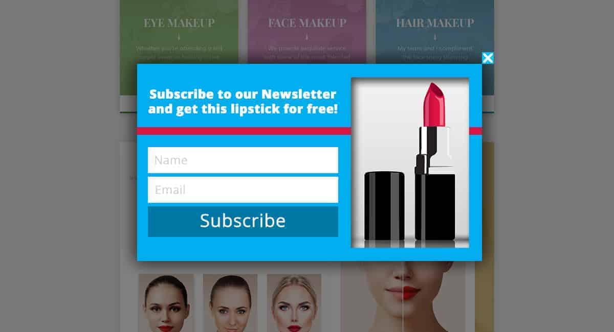
What do the consumers love the most about shopping on eCommerce sites?
Discounts and gifts! What can be more motivating than being offered a free piece of a product?
Use this general truth to get more subscribers to your newsletter. Offer free pieces instead of subscriptions.
Let’s say you’re selling cosmetics on your website and you desire to pull more sales compelling new subscribers. Do you know what can be an ideal pin-up to hit your sales in this case? Create an exit intention popup with a subscription form, and offer one of your products for free! Why open it on exit intention? Just because this is kind of essential to somehow convince the visitor not to leave the site without completing a purchase on your store. Make sure the image of the product is captivating enough to motivate the visitor to subscribe to your list to get the item as a gift.
Increase the popularity
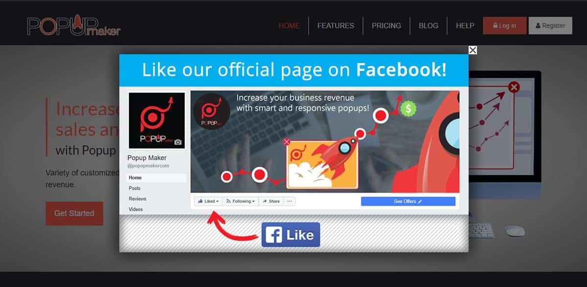
The more popular you are, the higher is the prospect your sales will increase. Endorsing your website is one of the essential impulses to gather more users and enlarge your sales.
That’s why you need to get more likes, shares, twits, etc. on social networks. This will provide you with guaranteed popularity and more people will learn about your service. So the probability of getting more users will grow more than you could imagine.
A great trick will be creating a popup with a “Facebook Like” button included. So your site guests will like your official Facebook page right through the popup. And again, the best way to show this popup will be to trigger it on Exit Intention. Visitors will take your service more seriously if they see the immense work you’re doing on your project, endorsing it site-wide and being available in many ways possible.

