Device Based Targeting
Attract visitors with engaging and super-responsive popup offers, depending on which device the website is viewed.Device-based targeting
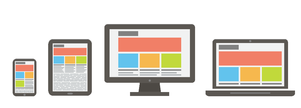
Proper device based targeting for website popups can be a lifesaver for any website owner. Popups can be galling if they are not acceptably designed and do not follow some canons concerning screen sizes. In case the pop up is too large on a mobile screen or on a tablet, it has all the chances to be annoying and you will hardly ever grab more visitors with such popups.
It’s very major to make and demonstrate popups suit all possible screen sizes, such as mobile, tablet as well as desktop. A perfectly sensitive popup should better not cover the whole screen, even more, it shouldn’t occupy more than 40% of the screen on mobile screens, for especially. This way you will be accepted by visitors to your site, as well as by Google, as you follow its latest announcement concerning popup sizing on mobile gadgets.
Besides the sizing, it’s also very major to consider the overall look of your popup info. Focus on the design so it will be maximally enticing and convincing.
Proper triggering per device
It’s also very major to consider the opening event for each device popup particularly. For mobile devices, for instance, ideal solutions are scrolling and delayed popups. It’s not a good practice to demonstrate a popup offer just as the visitor lands on your site, especially on a mobile device view.
Popup Maker grants you with an ability to pick the device for your popup showing, counting Mobile, Tablet and Desktop. Simply check the box to choose the device.
High-converting popups
Build up enticing and highly converting popups for every screen size separately. Present one-click popups for mobile gadgets, that won’t take much efforts and time to submit via mobile devices. If you crave to collect subscribers, for example, be as brief as you can. Propose sales and build in an email field so the visitor can enter it and submit to in your subscription popup to receive the discount to their email.
For high-converting popups on desktop and tablet devices, you can include more info, with larger images, and more design solutions. You can show highly converting mobile exit-intent popups, in addition, restrict them for desktop only. It’s all in your hands! All possibly essential options are available for you to run a cleverer popup campaign for your website.